

The word data has been among the world’s most used words for quite some time now. Analyzing data means making sense of it by using various techniques - called data analysis techniques - and tools. For example, if a child has some problems in learning, you collect information from her parents and/or peers on her behavior. Next, you gather more information through research on what could be the real problem and why the child is not able to learn well. Based on the information collected from various sources and perspectives, you can derive patterns, understand mood swings and emotions under different situations, and so on. This process is called data analysis, and the methods used for doing so are called data analysis techniques. Through the right analysis, we can help to solve the learning problem of the child and make plans to better her learning in the future.
Why Data Analysis?
Every industry is data-driven, and out of the humungous proportions of data that users generate every day, even if we can put 1% of data to use, it can give us a lot of valuable insights about many things. Data can be analyzed and used in many ways by businesses to get valuable predictions and use cases for the future. For example, using the preferences and most visited pages of a user, Facebook suggests other similar pages to the user. Likewise, Amazon recommends products to users based on their shopping preferences. Similar to the previous two examples, Netflix recommends movies to users based on the type of movies they generally prefer. Moreover, sales representatives analyze the buying preferences of customers to promote different products. This improves customer experience as well as gives better direction to businesses.
The Process of Data Analysis
Before we get into the data analysis techniques, let's understand the entire data analysis process so that you can appreciate the techniques better. Data analysis involves the following steps:
- Understanding the problem statement (specification) : Identify why you need to perform data analysis and what kind of data you would need.
- Data collection : Collect data from various sources, like surveys, databases, and interviews.
- Data cleaning and filtering : Remove the unnecessary data, i.e. clean, sort, and filter data.
- Apply algorithms, statistical tools, and techniques to gain insights.
- Visualize the results, generate results, and make predictions.
- Find trends and make future business decisions.
Data Analysis Techniques Classification
There are many types of data analysis techniques. The information on the web about the same is overwhelming and sometimes confusing. You will find the different classifications as shown below:
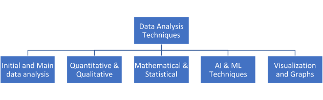
1. Initial and Main Data Analysis
Initial data analysis doesn’t talk about the main business problem at all. It is concerned with the following:
- Data quality
- Quality of measurements
- Mathematical transformations
- The success of the randomization process
- Characteristics of the data sample
- Documentation of the findings in this stage
- Nonlinear analysis
The techniques used for initial analysis are:
1.1 Univariate (single variable)
It is the simplest of all, involving just one variable. There are no relationships. For example:
| Age group | number of people |
| 0-10 years | 0 |
| 11-25 years | 4 |
| 26-40 years | 13 |
| 41-65 years | 27 |
| > 65 years | 3 |
The patterns in univariate analysis can be determined using central tendency, standard deviation, and dispersion methods (we will describe them later in this article).
1.2 Bivariate (correlations)
If there are two variables in your analysis, you tend to find correlations. The two variables can be independent or dependent on one another. For example, you might want to categorize students on the basis of their average marks and branch of study:
| Group # | Avg. Marks | Branch |
| Group 1 | > 70 | Computers and IT |
| Group 2 | 55-70 | Electronics and Electrical |
| Group 3 | 45-55 | Chemical Engineering |
Scatter plots, regression analysis, and correlation coefficients are the common types of bivariate analysis.
1.3 Graphical Techniques
Graphs provide quick visual references to view the entire data characteristics. Also, graphs are easier to comprehend than statistical equations. Some of the most useful plots are box plots, time series, scatter plots, histograms, and probability plots. These can easily identify outliers, ranges, relationships between variables and datasets, and much more.
1.4 Nominal and Ordinal Variables
Nominal and ordinal variables are used to subcategorize different types of data. The nominal scale is used to label the data. For example: What is your favorite color? It can be yellow, blue, red, pink, orange, and so on. What is your gender? - Male, female, or transgender. How is the drink? It can be hot, cold, or warm. The labels having only 2 categories are called dichotomous.
1.5 Ordinal Scale
It is a scale that sub categorizes values based on the order. There is a vague difference between the shift from one value to another. For example, you might have seen surveys like: How was the food? It can be bad, average, good, very good, excellent, and so on. You cannot quantify the difference between average and good, or good and very good, etc.
1.5 Continuous Variables
Analysis of continuous variables can be done by comparing mean values. It is much useful in medical research that can have a different range of values. For example, the measure of the heart rate and blood pressure level. Different types of statistical tests can be applied to the datasets based on whether the data is distributed normally or non-normally. Here is a table that summarizes the different tests:
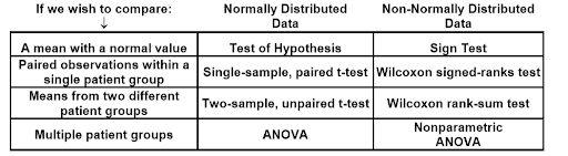 Source:
SurgicalCriticalCare
Source:
SurgicalCriticalCare
Main data analysis is done to answer the question that led to the analysis and submit a report based on the research. It involves:
- Exploratory or Confirmatory Approach: In exploratory data analysis (EDA), datasets are analyzed visually to infer the main characteristics. EDA is the next step to initial data analysis and can use statistical methods as well. It is done just before applying algorithms for building models, and if the results are not up to the mark, the data needs to be processed or cleaned again. The most popular methods for EDA are:
-
- Graphical Techniques: Box plots, histograms, multi-variate charts, run charts, scatter plots, etc.
- Dimensionality Reduction: PCA, multilinear PCA, and non-linear dimensionality reduction.
- Quantitative Techniques: Trimean, ordination, and median.
- Stability of Results: The model applied to analyze the data should work for new data with at least the same accuracy as the training data. This can be done through model validation and bootstrapping .
2. Quantitative vs Qualitative Data Analysis Techniques
2.1. Quantitative Data Analysis
Quantitative data can be expressed in numbers and can be discrete (like the number of questions in the exam or number of words in a document) or continuous (age of a person, height of a building, etc.). It can be represented using graphs and tables. Quantitative data analysis can provide limited outputs such as identification of a problem or give direct answers to questions in terms of numbers. For example, one cannot say whether a person failed or passed without knowing the passing score. It can be said that the person got 45% marks based on some calculations. In simple words, quantitative data analysis alone cannot make any concrete decisions.
2.2 Quantitative Data Analysis Techniques
2.2.1 Frequency Distribution (Histogram)
Through frequency distribution, we can get a big picture of how often specific values occur in the dataset. The most popular tool for frequency distribution is the histogram. A common example of a frequency distribution is to find the income brackets of various persons in a dataset. For example, how many persons are in the bracket of less than 5 lakhs per annum, 5-10 LPA, and 10-25 LPA.
2.2.2 Descriptive Statistics
Central tendency (mean, median, mode) and dispersion are used to analyze the data further. Central Tendency
- Mean - It is the average value of the entire sample. It is very commonly used, especially when there are no outliers in the data.
- Median - It is the middle value of the entire distribution. For example, for numbers 1 to 23, the median would be 12, whereas, from 1 to 22, the median will be 11. If there is an outlier or data values are unevenly distributed, the median is quite useful.
- Mode - When there is non-numeric data, we can use mode, i.e. the most popular item in the distribution.
Dispersion
- Range: It is the difference between the highest and lowest values of the variable. If the range is high, it indicates that the values are more dispersed.
- Variance: It is the average of the squared difference from the mean.
- Standard deviation: Indicates how much variation a variable exhibits from its mean value. It is the square root of variance.
2.2.3 Comparing Means (T-Tests)
The T-test is an inferential statistical method used to find if the difference of means of two groups related to each other in features is statistically significant, i.e. the sample that we have taken for testing represents the population accurately.
2.2.4 Cross-Tabulation
Known as a pivot table in Excel, it is a popular technique wherein the relationships and interactions between different variables can be clearly understood. It can analyze categorical data and represent data in an easy-to-view manner.
2.2.5 Correlations
Correlation is used to analyze the relationship between two variables. For example, the chances that a person who is going to work will not have time to watch mega serials are quite high. So we can say that the two factors or variables are directly correlated.
| Correlation value | Relationship between the 2 variables |
| 0 | No relationship. |
| 1 | Direct positive relation, i.e. increase in one variable will increase the other too. |
| -1 | Inverse or negative relation, i.e. an increase in one variable will decrease the second and vice-versa. |
2.2.6 Linear Regression
Regression techniques are more accurate than correlation. It shows a good fit in the data and helps in the statistical testing of the variables. Linear regression is the most popular and easiest way. It can be represented as y = ax + b, where y is the dependent variable, and a is the intercept that indicates the relationship between x and y. For example, if a is negative, it would indicate an inverse relationship between x and y.
2.2.7 Text Analytics
Text analytics comes in handy when there is a huge amount of data from which we need to find only useful text. For example, we can use text analytics to scan thousands of resumes by looking for certain keywords on the basis of the requirements, such as digital, SEO, marketing, manager, and tools.
2.3 Qualitative Data Analysis
Qualitative data provides depth to the results of quantitative analysis. It can define a problem, generate new ideas, or make decisions. Qualitative data can be collected through group discussions, interviews, archived data, observations, case studies, etc. This type of analysis is exploratory and subjective. Qualitative data analysis techniques are further divided into two approaches: deductive and inductive.
- Inductive Analysis - This starts with a ‘question’ and collection of relevant data that are used to obtain a hypothesis or theory and identify patterns. This type of qualitative analysis requires more time and is thorough.
- Deductive Analysis - Starts with a hypothesis or a theory that is then proved by collecting data and performing analysis. Since we already know what we are collecting data for, this type of analysis is quick.
2.4 Qualitative Data Analysis Techniques
2.4.1 Content Analysis
Content analysis is the process where verbal or behavioural data is categorized to classify, summarize, and tabulate the same. Using this technique, researchers can look for specific words or concepts in the entire content and identify patterns in communication.
2.4.2 Narrative Analysis
Involves the analysis of the same stories, interviews, letters, conversations told by different users and identifying the context of the respondents while doing so. It is mainly used for knowledge management, i.e. identifying, representing, sharing, and communicating knowledge rather than just collecting and processing the data.
2.4.3 Discourse Analysis
It is used for analyzing spoken language, sign language as well as written text to understand how language is used for real life purposes. Discourse can be argument, narration, description, and exposition. For example, a discourse between teacher and student, child and doctor, etc.
2.4.4 Grounded Analysis
In this approach, one single case is analyzed to formulate a theory. After that, additional cases are examined to determine if the theory works for those cases as well. This method uses inductive reasoning, i.e. moves from the specific case to generalization.
2.4.5 Framework Analysis
Framework analysis is applied to projects that have specific questions and a limited time frame. This technique provides highly structured outputs of summarized data. For example, analysis of interview data. The researcher listens to the audio and reads the transcripts line by line, applies labels (or code) describing the important parts of the interview. Multiple researchers can work on the same data and then compare their labels or code to narrow down the codes further to analyze and apply for the rest of the transcripts. The code then acts as a framework. Since the interview data is qualitative, it is huge in volume. That’s why the data is charted into a matrix and summarized. Steps to conduct qualitative data analysis –
- Applying codes
- Determining patterns, themes, and relationships
- Data Summarization
3. Mathematical and Statistical Techniques
3.1 Dispersion Analysis
This type of analysis helps us in determining the variation in the items. The dispersion measures the variation of items among themselves and then around the average. In simple terms, variation means the degree to which the entire data is spread. Some techniques for dispersion analysis are variance, standard deviation, interquartile range, box plots, and dot plots.
3.2 Regression Analysis
This is a powerful data analysis technique to find relationships between two or more variables. It is used to find trends in data. Regression can be linear, non-linear, or logistic.
3.3 Resampling
Consists of taking out small, repeated samples from the original data samples. Rather than analytical methods, it uses experiments to get a unique sampling distribution.
3.4 Descriptive Analysis
Gives a fair idea of the distribution of data, detects typos or outliers, identifies relationships between variables etc., to make the data ready for further analysis. Descriptive analysis can be performed on three types of variables:
- Both variables are quantitative – In this case, we can use scatter plots.
- Both variables are qualitative – We can prepare a contingency table.
- One qualitative and one quantitative variable – We can calculate the summary for the quantitative variable classified using the qualitative variable and then plot box or whisker plots of the quantitative variable with the qualitative variable.
3.5 Factor Analysis
It is a data analysis technique that reduces the number of features or variables to a fewer number of factors. The technique uses eigenvalue as a measure of variance in the observed variable. Factors with less value of eigenvalue are discarded.
3.6 Time Series Analysis
It is a data analysis technique to find trends in the time series data (data collected over a period represented in terms of the time or interval). Through this analysis, we can use an appropriate model for forecasting and hence make better business decisions.
3.7 Discriminant Analysis
This technique classifies data into smaller groups on the basis of one or more quantitative variables. For example, a doctor can identify those patients who are at high, medium, or low risk of COVID-19 based on attributes like cough, fever, sneezing, etc.
4. AI and ML Techniques
4.1 Decision Trees
Decision trees split the data into subsets by asking relevant questions related to the data. Read more about decision trees .
4.2 PCA
This is a technique that reduces the dimensionality of the data by rotating and achieving the principal directions. PCA considers the direction with the highest variance to be the most important.
4.3 SVM
In this data analysis technique, data is mapped to a higher dimensional space to categorize the data points. Even if the data is otherwise linearly separable, mapping can help achieve the results. The hyperplane is selected such that the variables are separated in the best possible manner. Among other applications, SVM is widely used in sentiment analysis to detect if the statement made by a person is positive, negative, or neutral. It separates positive and negative words (happy, angry, sad, good, excited, etc.) using the training dataset and then classifies any new statement for validation.
4.4 Artificial Neural Networks
These are a series of algorithms that recognize the underlying relationships in a set of data that follows how a human brain would work. ANN is inspired by biological neural networks. Such programs learn on their own without much external supervision or support. ANN algorithms are widely used in gaming, pattern recognition, face detection, image recognition, handwriting recognition, etc. They can also be used to detect diseases like cancer.
4.5 Fuzzy Logic
Most of the situations in real life are vague or fuzzy. For such uncertain cases, fuzzy logic provides flexible reasoning. For example, “Is the dessert sweet?” can have answers like yes, a little, a lot, or no. Here, little and lot tell us the degree of sweetness. These can be thought of by humans. For example, rather than just saying the dessert is sweet, a human would perhaps say it is less sweet or too sweet. Fuzzy logic aims to incorporate the same deductive thinking to a computer, which can help in decision making and dealing with uncertainties.
4.6 Simulation Analysis
Getting real-time data for training and testing ML algorithms become a challenge, especially for critical projects where high-quality data is required, and you are unable to judge which algorithm is best to use. Using simulation data can give you control over the features, volume, and frequency of data. You can perform an analysis of simulation data to identify the right algorithm for a particular problem.
4.7 Market Segmentation Analysis
It is the study of customers by dividing them into groups based on their characteristics like age, gender, income, and lifestyle preferences. This way, companies can target a smaller amount of audience, known as the target audience, for promoting their products. For example, men in the early 30s are more likely to use electronic products than men above 65 years. K-means clustering and latent class analysis are some popular methods for market segmentation analysis.
4.8 Multivariate Regression Analysis
Implemented using matrix operations, this data analysis technique measures the degree of linearity between one or more independent variables with one or more dependent variables. It is an extension of linear regression and involves selecting the features, normalizing the features, selecting the hypothesis and cost function, and minimizing the cost function and testing the hypothesis. For example, a doctor wants to analyze the health of people of various age groups based on their eating, exercise, and sleep patterns. She collects all this data to analyze how a healthy diet, exercise, and discipline can lead to a healthy lifestyle.
5. Visualization and Graphs techniques
5.1 Charts and Plots
5.1.1 Column and Bar Chart
These charts are used to represent numerical differences between different categories. A bar chart can be plotted horizontally or vertically. Vertical bar charts are called column charts. Each category in the chart is represented by a rectangle (bar), where the height of the rectangle represents the value.
5.1.2 Line Chart
The data points in line charts are represented as a continuous straight line. Line charts are used to show trends over a period of time.
5.1.3 Area Chart
Area charts are used to depict time-series relationships. In area charts, data points are plotted using line segments. The area between the line and the x-axis is filled with some color or shading.
5.1.4 Pie Chart
It is a circular chart that represents the proportions of data based on various categories. The length of each slice accurately represents its proportion when compared to other slices in the chart.
5.1.5 Funnel Chart
Of course, it is a funnel-shaped chart and often represents stages and potential revenue per stage in a sales process. We can visualize the progressive reduction in data as it passes through each stage. The top of the chart is the broadest while the bottom is the narrowest.
5.1.6 Scatter Plot
Scatter plots show the relationship between two sets of numeric variables as X-Y cartesian coordinates. The values of the variables are represented using dots.
5.1.7 Bubble Chart
Bubble charts add dimension to the data; hence, you can represent the relationship between three variables. The third dimension is represented by the size of the bubble (circle).
5.1.8 Gantt Chart
It is a horizontal bar chart often used for project scheduling, planning, tracking tasks, and overall project management. Gantt charts can take in complex information about the project and display it in an easy to understand way.
5.1.9 Frame Diagrams
Using frame diagrams, we can represent the hierarchy in the form of an inverted tree structure.
5.2 Maps
5.2.1 Heat Map
Uses color as a visualization tool for data analysis. For example, if you want to know the red zones where COVID-19 is more prevalent, the heat map will show it in an easy-to-visualize manner.
5.2.2 Point Map
It stores spatial geographical information represented using points. The points can be identified using class names, values, or ID.
5.2.3 Flow Map
Flow maps show the movement of objects or people from one location to another. For example, migrant workers moving from one state to another during the COVID-19 lockdown period can be tracked using flow maps.
5.2.4 TreeMap
Represents a horizontal hierarchical structure as a big rectangle. Each smaller rectangle inside the big rectangle indicates the proportion of a variable.
Tools for Data Analysis
Like data analysis techniques, data analysis tools also play a significant role in successful data analysis. Here are brief introductions to some of the most popular data analysis tools:
- R and Python: Powerful and flexible, these programming languages have many libraries to perform complex calculations, generate graphs, and perform predictive analysis. R particularly has loads of libraries for statistical analysis, such as regression analysis and cluster algorithms.
- KNIME: It is an open-source tool that can perform data pre-processing, cleansing, ETL, analysis, and visualization. KNIME is a great tool for those who have less programming knowledge but have good business know-how.
- Tableau: Tableau is a powerful data analysis and visualization tool. You can load data from various sources and drag and drop elements to analyze data from various perspectives. Note : Learn more about Tableau by reading our ‘What is Tableau’ article.
- SAS: SAS is another great tool for non-programmers that can perform data preparation and integration of data from various sources. SAS tools use the SAS programming language as the base and have complex data analysis capabilities.
- Excel: Excel is everyone’s favorite. Well, almost. Starting your data analysis journey with excel will help you get a feel of charts, filters, and other data preparation and transformation activities easier and faster. Excel works well in providing insights for smaller data sets and can be integrated with SQL for real-time analysis.
- Fine Report: It is a nice drag-and-drop tool that has several options for data analysis. The format is similar to excel; however, the tool provides visual plug-in libraries and a variety of dashboard templates to design different types of reports.
Excel and Tableau are the best tools for data analysis through visualization.
Challenges in Data Analysis
Data analysis comes with many challenges, but the good part is that they are all solvable. Common challenges that occur during data analysis are:
- Overwhelming Amounts of Data: There is so much data generated every day that it is difficult to know what matters and what does not. This is a challenge whose solution is an automated system that organizes data and eliminates all the unnecessary data.
- Data from Multiple Sources: There might be different sets of data located in different places and formats. Missing any key factor can lead to incorrect analysis. The data collection stage is, thus, extremely important.
- Visual Representation of Data: Representing data in the form of graphs, charts, or any other visualization is easier to understand. However, doing this manually (for example, gathering information from various sources, then creating a report) is quite slow and annoying. Thankfully, various tools are available to help with this and make the life of a data analyst easier.
- Cognitive Biases: It is possible that people unintentionally tend to ignore or overlook information that doesn’t support their personal views and concentrate on information that supports their views. Such kinds of assumptions and uncertainty lead to biased analysis.
- Lack of Relevant Skills: Sometimes, even experienced professionals may not have the necessary experience in some techniques. This could lead to longer analysis time and less accuracy. The solution for this is to hire people with the right skills and to use analysis systems that are easily usable and understandable.
Examples of Data Analysis
Some common examples of data analysis are:
- Business intelligence
- Education
- Smart buildings
Check out Wikipedia to know more about these examples.
Conclusion
In this article, we saw various types of data analysis techniques and how each plays a role in achieving business solutions. To perform accurate data analysis, we need a strong team with good analytical skills that can perform thorough data collection, determine the statistical significance or goal, ensure the credibility of data and analysis methods, and report the accurate extent of the analysis. Once data analysis is complete, we should check for reliability and consistency of the results created using techniques like cross-validation and sensitivity analysis. Before you choose data analysis techniques to use for a particular problem statement, you should take into account the scope and nature of work, budget, infrastructure constraints, etc. Which data analysis techniques do you use for your project? What are your favorite data analysis tools? Put your suggestions in the comments section below.
People are also reading:


Leave a Comment on this Post