

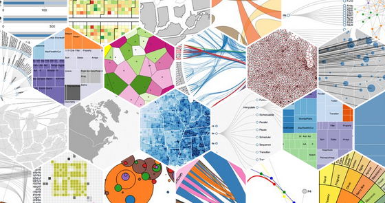
Data is growing at an unprecedented rate. When data grows exponentially, its true meaning becomes blurry and undecipherable. To read between the bytes, i.e. to interpret the data, we use data visualization. In its simplest definition, data visualization is the process of representing data in the form of visual elements, such as bar charts, graphs, pie charts, and Venn diagrams . The technique is immensely popular in dealing with modern data analysis requirements. For data visualization, we use data visualization tools.
Best Data Visualization Tools
Today, we have a wide range of data visualization tools that help in quickly spotting and understanding patterns, trends, and outliers in data. 11 of the best ones are as follows:
1. Tableau
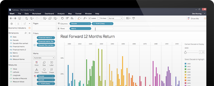
There are a few BI and data visualization tools that are comprehensive and support a range of options. One such is Tableau . It is available as a standalone desktop app (Tableau Desktop) as well as web-based (Tableau Online) and free-to-use (Tableau Public) variants. Tableau allows designing interactive charts and graphs as dashboards and worksheets.
The accessible data visualization tool also offers a diverse range of data import options, ranging from CSV and Google Ads data to Salesforce data. One can get the output in multiple chart formats using Tableau. Moreover, the data visualization tool also offers a mapping capability. From students and professional designers to SMEs and researchers, Tableau is for all.
Pros
- 100+ data import options.
- Excellent data visualization ability.
- Free version available.
- Mapping capability.
- Mobile-friendly.
- Proactive, expanding community.
- User-friendly.
Cons
- Difficult column table formatting.
- No privacy in the free version, i.e. there’s no way of keeping a data analysis private.
- Paid versions are more expensive than other commercial data visualization tools.
- Scheduling and auto-refreshing of reports are unavailable.
2. Microsoft Power BI
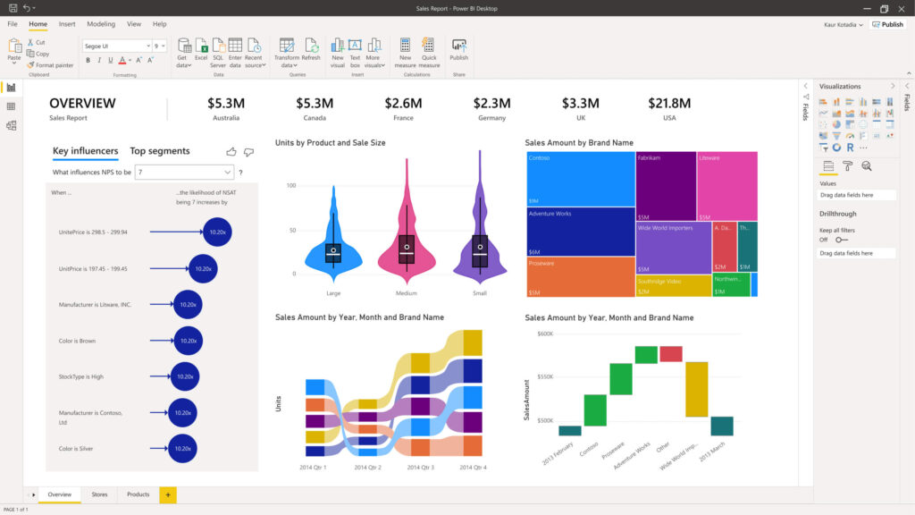
Developed by the tech mogul Microsoft, Power BI is an analytics and visualization tool. It allows designing customized dashboards and detailed reports by connecting to over 100 types of data sources. Power BI also offers real-time updates on the dashboard. Microsoft Power BI provides support for both mobile and web, allowing reports generated using the tool to be viewed on mobile devices as well as over the internet.
It also simplifies data preparation and offers instant analysis. Since there is no way of integrating Microsoft Power BI with other systems, it is possible to use it as a standalone BI tool only. Available in both free and paid tiers, Power BI offers several software connectors and services, and comes with an easy-to-use hybrid configuration.
Pros
- A galore of data visualization charts.
- Affordable pricing.
- Ample, detailed documentation.
- Big, mushrooming community.
- Cloud-based tool.
- Frequent updates are available.
- Good database connectivity.
- Strong brand integration with other Microsoft tools.
- Supports data exploration using natural language queries.
Cons
- Not suitable for handling humungous datasets.
- Steep learning curve.
- The cloud variant doesn’t have all the features as the Windows variant.
3. Infogram
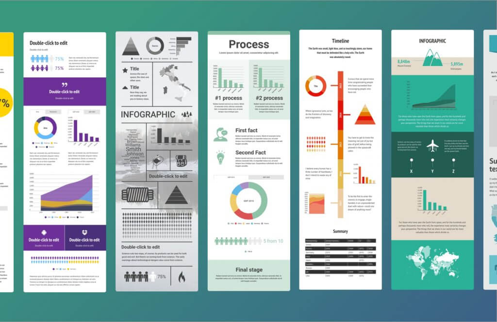
Infogram is a web-based, visualization, and infographics platform that features drag-and-drop functionality. It lets users - even people with no designing background - easily create and share digital charts, infographics, and maps. GIF, HTML, JPG, PDF, and PNG are some of the popular formats that Infogram allows finalized visualizations to be exported into. The data visualization tool features a WYSIWYG editor that converts user data into infographics suitable for embedding, publishing, and sharing. Infogram is also available as a WordPress plugin that further eases the process of embedding visualizations in WordPress-based websites. The visualization tool is available as both free and paid - Pro, Business, Team, and Enterprise - versions.
Pros
- 35+ charts and 200+ maps.
- A suitable platform for handling complex data.
- Allows connecting visualizations to live and public data sources.
- Even the free version offers a good range of features.
- Intuitive drag-and-drop editor.
- Supports importing additional data sources via an API.
Cons
- Automatically adds the Infogram logo on designs developed using the free version. It also lacks a rich text editing feature.
- Competitors offer more data integration features.
- It has fewer inbuilt data sources compared to other data visualization tools.
4. Dundas BI
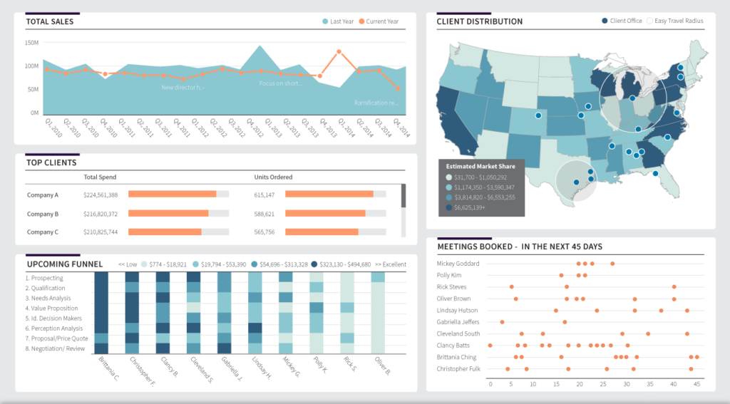
An enterprise-ready BI platform, Dundas BI offers highly interactive visualizations. Data labels, indicators, rich scorecards, smart tables, sparkline, and treemap are some of its outstanding visualization features. Dundas BI can be integrated into any website or deployed as the central data portal for an organization. Based on the responsive HTML5 technology, the data visualization tool lets its users connect, analyze, and interact with their data on any device. Organizations leverage Dundas BI to prepare and transform business data into meaningful and expressive reports. Further, it offers a vast range of layout options and the ability to customize interactive charts, maps, et cetera.
Pros
- Customizable data visualizations.
- Drag-and-drop functionality is available.
- Enhanced design possible via the API.
- Excellent level of official support.
- Provides support for a range of statistical formulae.
- Supports writing direct SQL for the chosen data source.
Cons
- It doesn’t provide support for 3D charts.
- Free version unavailable.
- No predictive analysis.
5. D3.js
D3.js is a free and open-source JavaScript library that facilitates visualizing data using CSS, HTML, and SVG. Interestingly, D3 stands for D ata- D riven D ocuments. Hence, it allows for creating dynamic and interactive data visualization in web browsers . Although using D3.js requires some skill in JavaScript, apps are available - such as Ember Charts, NVD3, and Plotly’s Chart Studio - that allow non-programmers to benefit from the popular JS library. D3 brings together powerful visualization components, data-driven DOM manipulation methods, calculating graphics, and layout algorithms.
Pros
- Completely free to use in addition to being open-source.
- Focuses on web standards.
- Offers support for a range of chart types.
- Powerful SVG capability. Easily maps data to the SVG attribute.
- Robust community support.
Cons
- API is too low-level.
- Suitable for designers with either JS expertise or access to a JS-skilled programmer.
6. Cluvio

Cluvio is a trusted data visualization tool for representing data as meaningful charts and graphs. The data visualization platform allows its users to run SQL queries on their database(s). It also lets them visualize the result to get a better meaning of it. With Cluvio, one can quickly design elegant, interactive dashboards.
Furthermore, these dashboards can be shared with clients and colleagues easily via links and can be accessed by others without necessitating logging in. Filtered views and visual discovery features are also available in Cluvio. Moreover, the cloud-based analytics and visualization platform is ideal for startups and data-driven teams. Other than SQL, the platform also supports the R programming language for performing analytics.
Pros
- Automatically generates suggestions for visualizing available data as a chart.
- Excellent official support.
- Filters multiple dashboards by any data attributes.
- It offers excellent ease of use and a superb UX.
- Supports specifying SQL alerts.
Cons
- It might be an expensive option for smaller businesses.
- No free version is available.
- The dashboard design/feature list could be better.
7. Datawrapper
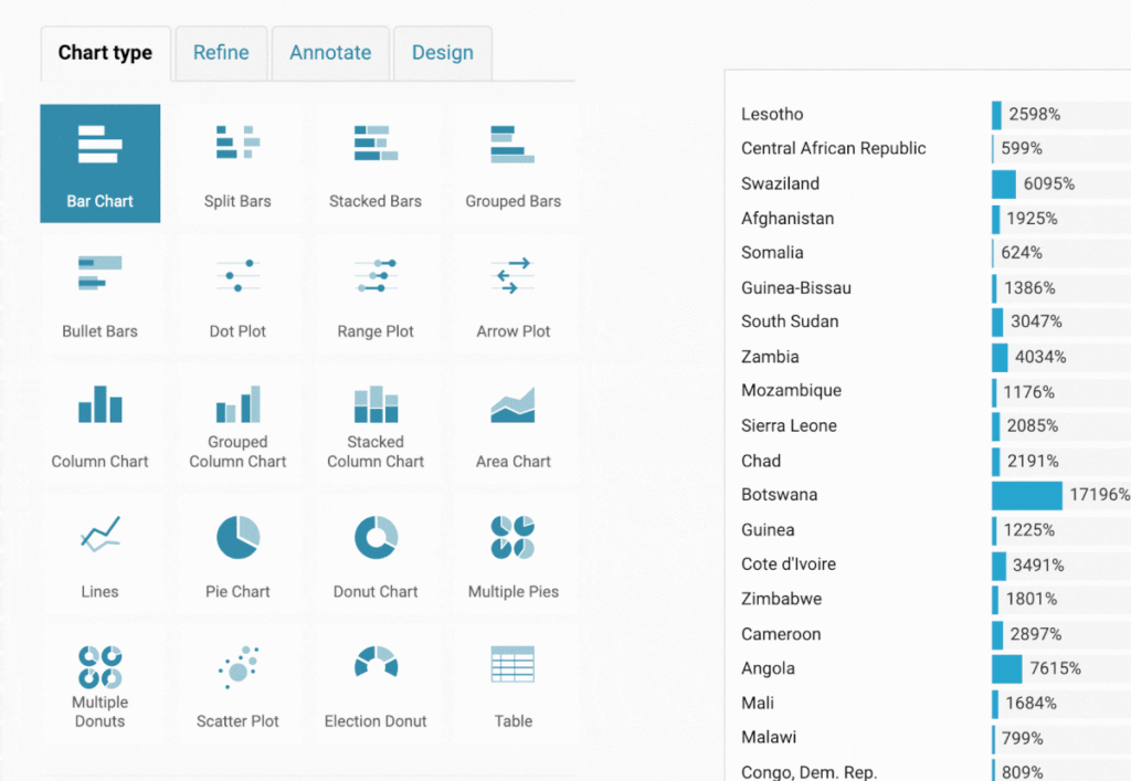
Explicitly developed for adding interactive charts, maps, and tables to news stories, Datawrapper is a popular data visualization tool. Fortune, The New York Times, and Wired are some of the reputed clients of the data visualization tool. Datawrapper lets users load CSV files to craft meaningful visualizations and then embed the same into webpages . Unlike other popular data visualization tools, however, support for data sources is limited.
The primary method for loading data is the classic copy and paste. One of the significant highlights of Datawrapper is that it can be customized without dealing with any code. Also, the free tier of the visualization tool is useful for embedding graphics to small websites with limited traffic. For more significant projects, paid tier is available.
Pros
- Built-in color blindness checker.
- Supports connecting visualizations to Google Sheets.
- Create charts with a single click.
- Free version available.
- Provides support for any device running on Linux, macOS, and Windows platforms.
- It is tailor-made for embedding visualizations to news websites.
Cons
- Costly paid plans.
- Limited chart and map types.
- Supports only a few data sources.
8. Domo
Domo is a mobile and cloud-based business intelligence and data visualization platform. It lets users analyze data and create interactive visualizations, such as graphs and pie charts. The data visualization tool also helps in simplifying administration data. Support for micro and macro-level analysis and visualization are also available in Domo. Moreover, the data visualization tool offers:
- A real-time view of the available data,
- Setting up customized alerts, and
- The ability to integrate with a range of software.
Also, one can personalize the Domo dashboard as per their requirements. It flaunts the ability to monitor data correlations, summaries, and much more automatically. Data visualizations created using Domo can be viewed on any device.
Pros
- Excellent sharing features.
- Free version available.
- Impressive collaborative ability.
- It offers a galore of data connectors.
- Real-time dashboards.
- Seemingly endless visualization and reporting features.
- Unrestricted data storage.
Cons
- No ML and NLP components.
- Non-intuitive UI.
- Not easy to learn and use.
9. Google Charts
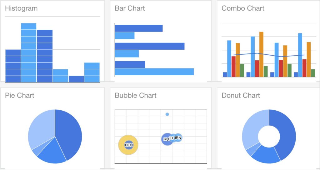
Google offers a data visualization tool in the form of Google Charts. It is specially designed for developing interactive charts for embedding in web projects. Data sources supported by the data visualization tool are:
- Google Fusion Tables
- Google Spreadsheets
- Salesforce
- SQL databases
One of the significant highlights of Google Charts is customization support. Also, the output generated by the data visualization tool from Google doesn’t require any additional plugins in websites, as rendering is purely based on HTML5 and SVG.
The Google Charts platform provides support for a galore of chart types, such as area charts, column and bar charts, and scatter charts. Simple CSS editing is all that is required to customize them.
Pros
- Completely free to use.
- Easy to get started.
- A high degree of interactivity.
- Interactive dashboard.
- It offers cross-browser compatibility.
- Supports a galore of chart types.
- The ability to use any SQL database makes it a suitable option for large datasets.
- Works with dynamic data.
Cons
- Limited support, no demos available for advanced features.
- Preparing complex presentations using API isn’t easy.
- The sophisticated statistical processing is unavailable.
10. HighCharts
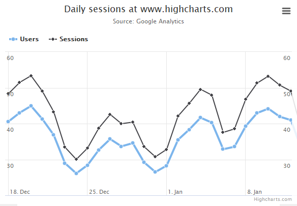
Written in JavaScript, HighCharts offers a simple way of adding interactive charts to a web app or website. Although based on SVG, the JavaScript charting library has fallbacks for canvas and VML for supporting older browsers. HighCharts is one of the most widely used web-based chart tools. That’s partly because the effort required for using it is low as compared to other JS-based charting libraries.
Moreover, it is a mature JavaScript library that offers a good level of compatibility. The data visualization tool is completely free to use for educational purposes, personal projects, and non-profit intents. To use the JavaScript charting library for commercial purposes, a license is required to be secured.
Pros
- Comprehensive documentation and thorough demos are available.
- Easy to use.
- Free version available.
- Excellent compatibility with mobiles and tablets.
- Has an API.
- Modifying axes in a chart is available.
Cons
- Expanding the charts is difficult.
- It offers charts only. So, no maps and tables.
- Seemingly old-fashioned.
11. ChartBlocks
ChartBlocks is a cloud-based data visualization tool that lets users create charts and embed the same to websites. It is possible to customize a chart significantly and sync it with data, which can be imported from anywhere via the ChartBlocks API. To ensure that the user chooses the best data for their charts, ChartBlocks feature a chart-building wizard.
Also, it is possible to create any type of chart using the cloud-based data visualization tool. The output generated by ChartBlocks is fully responsive, making it suitable for embedding to webpages meant to be viewed on a range of devices.
Pros
- Affordable pricing.
- Allows creating charts on any device with any screen size.
- Creating basic charts and graphs is very easy.
- It offers a galore of customizable chart types.
- Superb free plan.
- A wide range of data import options, including databases and spreadsheets, are available.
Cons
- Although ChartBlocks claims to allow creating charts “in a few simple clicks,” using the API, it is not so. Doing the same is bound to be difficult than using automated means to do the same offered by other data visualization tools.
- No mapping capability.
Conclusion
Owing to the exponential growth in data and information, there is no scarcity of data visualization tools. It is, however, essential to choose one that is relevant to your needs. You probably don’t want to compromise with your options, especially when there are so many of them available.
Free data visualization tools are usually enough to fulfill personal/hobby projects. Nonetheless, there are several premium options available, too, for meeting commercial and organizational requirements. Thankfully, many of them feature free trials to let the user check whether it is the tool that they’ve been looking for or not.
People are also reading:


Leave a Comment on this Post