

Before talking about Python data visualization, let's talk about data visualization. It is one of the most significant skills that every data scientist must possess, and it’s not something that a data scientist can ignore. Data visualization is an ocean itself and there are a number of courses and resources to learn and work in this specific field of data science. There are many universities and institutions that provide data visualization courses and there are many labs that focus solely on data visualization. Right now, we deal with big data , which is generally messy and unclean. As such, data scientists need to:
- Process the same,
- Filter and extract the valuable data, and
- Visualize it.
After we process and extract the data, we need to visualize it so that we can communicate the data findings better with other people and take appropriate actions. That is what data science is all about.
What is Data Visualization?
There are many definitions of data visualization. Two of the most popular ones are:
- “The use of computer-supported”, interactive visual representation of abstract data amplify cognition [by Card et al. 1999]”
- “The Representation and presentation of data to facilitate understanding [by kirk in 2016]”
Both the definitions of data visualization center around presenting and representing data, and both the definitions end with a key part of data visualization.
How does Data Visualization Help in Understanding the Data?
Suppose there is raw data of x and y coordinates and just by looking at the numerical values it might take you 4 to 5 minutes to tell the relationship between x and y coordinates. But if those coordinates are plotted on a graph then within a few seconds you can tell the relation between the two coordinates, and this shows the power of data visualization. With data visualization, we can understand the flow of data. Also, if the data is visualized properly then you do not need to be a master in mathematics or statistics to find out the relation of every data value. You can just look at the graph or other visualization presentation and tell the data insights.
Data Visualization in Python Using matplotlib
So now that we're done with the definition and purpose of data visualization, it's time to discuss Python data visualization. Python is popular for its data science and data visualization libraries. In Python, you will find many open-source libraries that can plot graphs based on the passed data. Here is the list of some of the best Python data visualization libraries :
- Matplotlib
- Seaborn
- plotly
- Bokeh
- ggplot
- pygal
Here in this article, we will only be covering the Python Matplotlib library and go through some of its basic graphs plotting style. The matplotlib is the standard Python data visualization library and it is highly compatible with many other Python data science libraries , like Pandas, Numpy, and scikit-learn. Even one of the most popular machine learning library PyTorch uses matplotlib to plot graphs.
How to Install Python Matplotlib Library for Data Visualization?
Matplotlib is an open-source library and you can easily install it using the Python pip command, as shown below:
pip install matplotlib
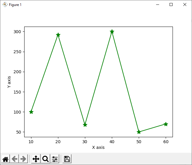
1. Plot a Line Graph Using the Python Matplotlib Library
Line graphs are very straightforward and only need x and y coordinates to plot the graph. To plot a line graph, we use the
plot()
method with the data of x and y coordinates. The
plot()
method also accepts some optional parameters such as color, marker, and markersize.
Example
import matplotlib.pyplot as plt
x_points = [10, 20, 30, 40, 50 ,60]
y_points =  [100, 292, 68, 300, 50, 70]
plt.plot(x_points, y_points, color= "green", marker ="*" ,markersize=10)
plt.xlabel("X axis")
plt.ylabel("Y axis")

plt.show()
Output
2. Plot a Histogram Using the Python Matplotlib Library
Histograms are similar to Bar Charts, but they are generally used to represent a group of numbers. Also, the maximum height of the histogram represents the maximum range of a specific data set. A histogram is often used to check the frequency of a data set. To plot a histogram using matplotlib we can use the pyplot
hist()
method.
Example
import matplotlib.pyplot as plt

studnet_ages = [11,13,12,12, 13,15,12,12,13,14,15,14,15,12,15,16,16,13]
bins = len(set(studnet_ages))
plt.hist(studnet_ages,bins)

plt.xlabel("ages")
plt.ylabel("Number of Students")

plt.show()
Output
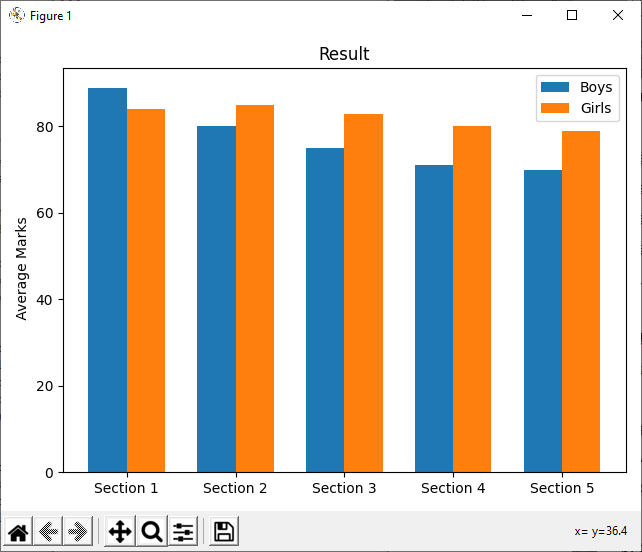
3. Plot Bar Charts Using the Python Matplotlib Library
In bar charts, we use the long bar height to represent the data. They really come very useful when you are representing the data related to a short survey.
Example
import matplotlib
import matplotlib.pyplot as plt
import numpy as np

sections = ['Section 1', 'Section 2', 'Section 3', 'Section 4', 'Section 5']
boy_means = [89, 80, 75, 71, 70]
girl_means = [84, 85, 83, 80, 79]

x = np.arange(len(sections))
width = 0.35

fig, ax = plt.subplots()
rects1 = ax.bar(x - width/2, boy_means, width, label='Boys')
rects2 = ax.bar(x + width/2, girl_means, width, label='Girls')

ax.set_ylabel(' Average Marks')
ax.set_title('Result')
ax.set_xticks(x)
ax.set_xticklabels(sections)
ax.legend()

fig.tight_layout()
plt.show()
Output
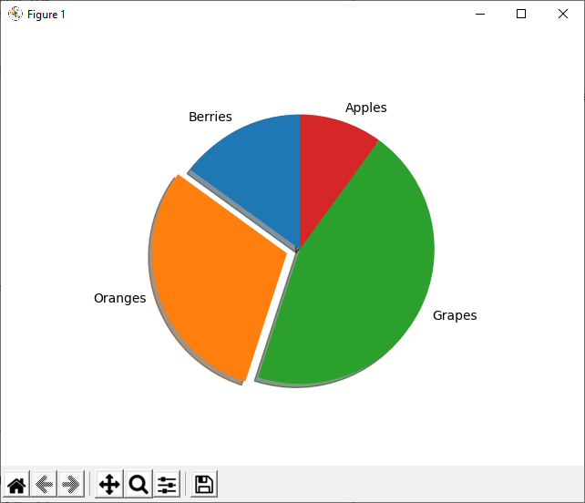
4. Plot a Pie Chart Using the Python Matplotlib Library
The pie chart represents the data sets like a slice from a pie. The larger slice represents the high frequency of the data set, while the smaller size represents the low frequency. We can create a pie graph with Python using the matplotlib
pie()
method.
Example
import matplotlib.pyplot as plt

labels = 'Berries', 'Oranges', 'Grapes', 'Apples'
prices = [15, 30, 45, 10]
explode = (0, 0.1, 0, 0)

fig1, ax1 = plt.subplots()
ax1.pie(prices, explode=explode, labels=labels,
        shadow=True, startangle=90)

plt.show()
Output
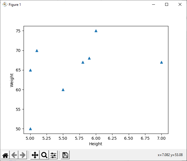
5. Plot a Scatter Plot Using the Python Matplotlib Library
The scatter plot is used to display the relationship between 2 data sets. For example, it can be used to display the relationship between the height and weight of different persons. To plot a scatter using matplotlib, we use the
scatter()
method. It can plot a scatter graph just by accepting the x and y data sets.
Example
import matplotlib.pyplot as plt
heights = [5, 5.5, 5,7, 5.8, 5.9, 5.10, 6]
weight = [50, 60, 65, 67,67,68, 70, 75]


plt.scatter(heights, weight, marker='^' )
plt.xlabel("Height")
plt.ylabel("Weight")
plt.show()
Output
How to Design Good Visualizations?
To design a good data visualization, the same must be trustworthy, accessible, and elegant:
-
Trustworthy
By trustworthy we mean that the visualization must be evident in its context. There must be solid evidence behind the visualization, and every aspect of the visualization must be clear to the user. For instance, just by looking at the data visualization, the viewer must get the overall insight of the data.
-
Accessibility
Your data visualization will not only be inspected by the experts but by non-experts too. So, the data visualization must be presented in such a way that everyone could understand the most out of it, if not everything. If the viewer is not able to get the representation, then the data could mislead the viewer. Hence, it becomes very important for the data scientist to know his audience and come up with such a presentation that is easily understandable.
-
Elegant
When we visualize the data, we only visualize that part of data that is more relevant to the context. A dataset could have more than one property associated with it, but during visualization, we only show one or two properties, and this is very important. We do not want so many properties to distort the visualization. If we associate too many properties in a single visualization, we will lose the main result and output. When we design the visualization, we should consider elegant styling and decoration, and there should not be unnecessary information on visuals.
Conclusion
Data visualization is an integral part of data science, and without it, you will have a hard time communicating the data to others. Python data visualization is very easy, and the credit goes to matplotlib, the standard Python visualization library. Please note that there is a lot in data visualization and here, we have just provided a brief introduction of it. Python is one of the most popular programming languages and thus, supports a galore of data visualization libraries. People are also reading:


Leave a Comment on this Post