

The word ‘Tableau’ literally means ‘picture’ or 'figure' representing a story or scene. That’s precisely what the software tool means, as we will explore in this article.
Apart from understanding what Tableau is, we will also explore different tools it offers, why learning it is essential both for programmers and non-programmers, and then dive into a detailed example (using the free software version) to show how easy it is to work with.
To briefly introduce you before starting the article, Tableau is a business visualization and business intelligence tool developed by Tableau, an American data visualization software company with a primary focus on business intelligence. It is one of the best tools in the business intelligence industry.
What is Tableau?
Although it is a BI tool, more specifically, Tableau is a data visualization tool that can generate charts, reports, and other visualizations. It makes reporting and analyzing vast amounts of data easy and quick. It can transform a lot of data into a comprehensible format without technical skills or programming knowledge. As a result, non-technical users can easily use this tool to transform raw data into an understandable format.
Anything that is displayed as visual registers in our minds better than text. This means human brains process visual data faster than text. In fact, the human brain processes images 60,000 times faster than text .
Tableau is an ideal tool for business analysts. It helps them calculate all the fields like average, median, mean, standard deviation, variance, etc. You may need some knowledge of writing simple queries for more complex charts. For example, sorting based on multiple conditions or grouping data based on different factors. Still, for the most part, you will not write anything. Just drag and drop!
Apart from the fact that this tool is flexible, secure, fast, and powerful, here are some features that give it the edge over other popular BI tools :
- Powerful data discovery and exploration.
- Real-time data analysis and data blending.
- Requires no coding or technical skills.
- Easy integration with R and Python .
- Can combine data from multiple data sources.
- Generate reports by combining data from different datasets.
- Able to handle large data sets.
- Mobile support is available.
- Interactive dashboard.
- Enables faster project completion.
- Each version comes with new capabilities.
- Great community support and superb documentation .
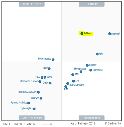
As per Gartner ratings, Tableau is as one of the leaders in BI and analytics for the last six years.
We had the term 'business intelligence tool' in the above discussion. Let us see what it means.
What is a Business Intelligence Tool?
A business intelligence tool provides methods and strategies to collate past, current, and future (predictive) data, generate and represent helpful business insights in charts, graphs, dashboards, and reports for data analysis , and make essential business decisions.
BI tools can easily handle a large amount of data, which can be structured or unstructured, from various data sources. Such tools save time and resources, making them the need of the hour for today’s data-driven world.
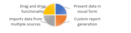
Tableau does all of the above! Here are some highlights of this popular BI tool:
- Drag-and-drop functionality.
- Import data from multiple resources.
- Present data in visual form.
- Custom report generation.
Why Tableau? Is it Worth Learning?
Do you remember working on Microsoft Excel? Yes, you most probably have used it for creating an invoice or for, reading tabular data, or finding the sum of many values. Excel works perfectly for a small amount of structured data; however, for vast volumes of data generated daily, a more robust tool like Tableau is superior to Excel (You will see how later in the article).
Tableau analyzes vast amounts of data quickly and represents the visualizations in dashboards and worksheets. Anyone can create dashboards that represent insights into data, making it easy for businesses to understand and make informed decisions.
The following are some major reasons why Tableau is worth learning:
- Allows you to work with unstructured and unordered data and create different visualizations.
- Gain detailed insights into data.
- Easy to learn and fun to use.
As many businesses and Fortune 500 companies are adopting this BI tool, it is worth learning and mastering it.
Tableau Product Suite
Here is what you get in the Tableau Product Suite:
- Desktop
- Public
- Online
- Server
- Reader
- Prep
These products fall under two categories:
- Developer Tools: These tools are used for developing dashboards, charts, report generation, and other visualizations. Tableau Desktop and Plublic are the two tools that fall under this category.
- Sharing Tools: These tools help you share visualizations, such as reports, charts, and dashboards. Tableau Online, Server, Reader, and Prep are sharing tools.
1. Tableau Desktop
Tableau Desktop lets you create, code, and customize reports and charts and combine them to form an intuitive dashboard. It allows you to view the story in your data through many options conveniently. You can drag and drop rows and columns to see different data combinations and work on them to visually arrive at new trends and outliers.
Also, you have a plethora of options in the dashboard. This includes connecting to a data source from the list of available sources (Excel sheets, MySQL, SQL Server, Oracle, data warehouses, cloud databases, etc.) and combining data from sources into a single view.
You can perform various actions like creating maps, finding the sum and median, or using filters. Basically, it lets you play with data in any way you want to. You can also switch between charts (for example, a Treemap to a histogram and vice-versa) and find the most useful view for the current data set. Further, it also finds trends and forecasts in the data.
All you have to do is click on the necessary options. Multiple people can access the interactive dashboards through the Tableau Server or Tableau Online. There are two versions of Tableau Desktop:
- Tableau Desktop Personal – Offers limited access. Workbooks are private; you cannot publish them online. Share them either offline or on Tableau Public.
- Tableau Desktop Professional – Full access to all data sources. The workbooks created are not private and can be published on Tableau Server.
2. Tableau Public
This is the version we will use for our example below. It is nothing but the public release of Tableau Desktop. However, the workbooks are not secure, and you cannot store them locally in Tableau Public. Instead, they are stored in Tableau’s public cloud, providing a way to access and view workbooks by everyone in the organization. Most learners and first-time users use this tool to get a hands-on experience with Tableau.
3. Tableau Server
It lets you share your workbooks; everyone across the organization can access it from desktop or mobile. It offers a secure environment. This helps businesses create insights and answer in-depth questions on the go, making project execution faster and easier. You can load different sources and extract data from these sources or use live data for your analysis.
The tool ensures you are using the right data for your review. It has options to inform others if a particular data set or field is obsolete for use through a simple message. By creating colorful visualizations, you can focus on the areas that need improvements for your business to grow.
Whether you drag and drop fields to get your answer or type your query in natural language, you will instantly get your answer in a visual form. The server enables data management, like adding or removing data sources, permissions, views, and subscriptions, and thus enhances manageability, security, and scalability.
4. Tableau Online
Tableau Online is a Software-as-a-Service you can use anywhere without hardware installation. The features are analogous to Tableau Server, but the only difference is that this service stores data in servers hosted in the cloud .
You can explore, modify, visualize, and create insights through the browser, tablet, or mobile phone. Also, you can access different data sources and connect to them on-premises or through the cloud. You can also add as many users as you want to access the workbooks you create and work on the data together.
This compelling use of technology enables you to perform reliable and quick analysis as a team. As mentioned, you can also create your work on Tableau Desktop and then share and collaborate with others through Tableau Online to allow them to access your work and ask their questions about the data from different perspectives.
5. Tableau Reader
It is a simple tool allowing you to view and read workbooks and visualizations created using Tableau Desktop and Public. It does not guarantee the security of your workbooks, as anyone having access to it can view them using this tool.
6. Tableau Prep
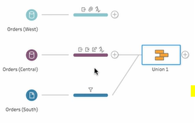
This powerful tool helps you view all your data in a single window and enables you to clean and prepare data for visualization. You can combine, reshape, reorganize, and clean data from multiple sources visually, drag and drop the parameters you need to prep(are) your data, apply aggregate, union, join, and other operations, and more.
You can also use calculations and see the results of joins and other query parameters to present data differently. This tool helps you fix outliers and data inconsistencies within minutes.
Moreover, you can view the changes as you perform them. If you think you made a mistake, you can go back to any previous versions with a click. You can also keep track of the workflows, schedule them, and receive alerts if something fails. The flows are integrated so that you can monitor and share the data across your organization through Desktop or Online.
How Does Tableau Work? [An Example]
Okay, enough for the theory. Let’s put it to practice now:
- Download Tableau Public and follow the on-screen instructions to install it.
- After the successful installation, open Tableau Public.
- Next, connect to a data source. The data sources can be anything, an Excel sheet, CVS, SQL server, Hadoop file, etc.
Example Dataset
We have created the following dataset (with limited data) using Excel for the Tableau example. However, you can also explore the existing sample datasets if you wish. Now, let's look into the data:
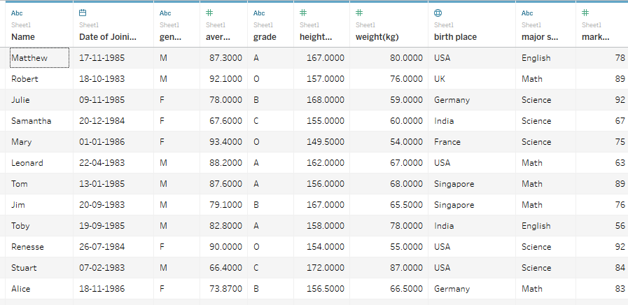
Out of the total rows, few are shown here. The data shows the names of students who joined on a particular date, their location/birthplace, average grades, average marks, and other information.
You can see all this data in the 1st tab of the Tableau tool. Once you load the data, you can move it to sheet1 . This is where all the magic happens.
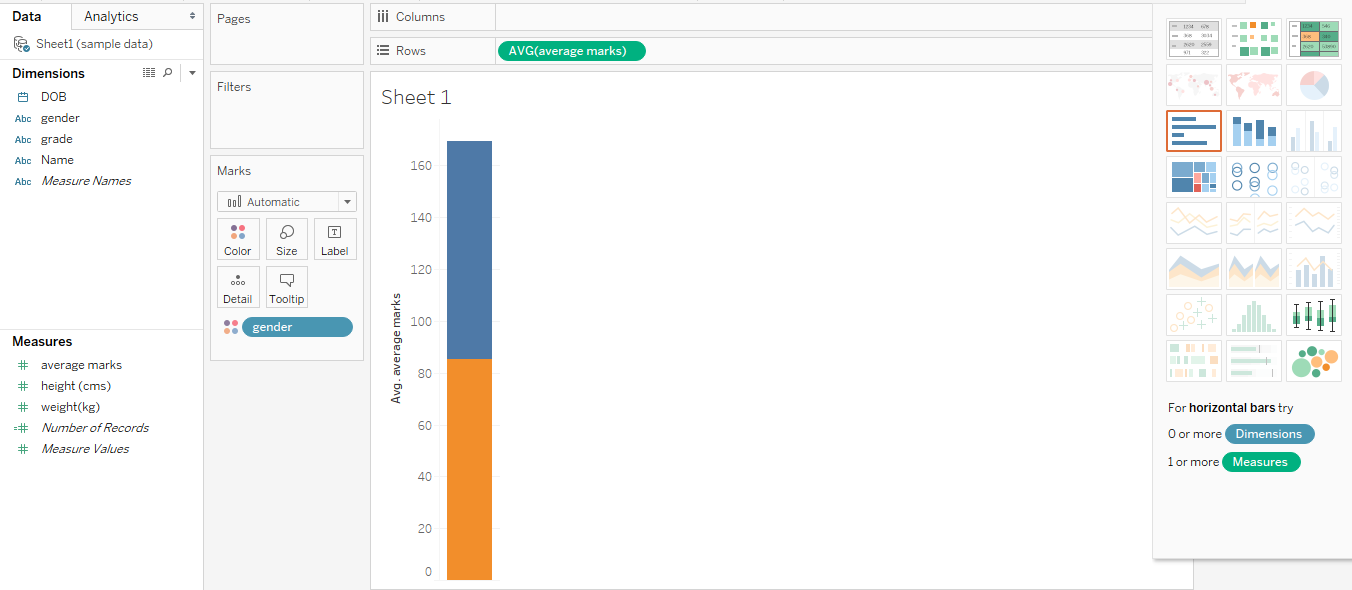
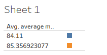
In the above example, we have generated a stacked bar that tells us about the average marks by male (m) and female (f) students. The parameters in green are measures - average, sum, height, and weight, and those in blue are dimensions - location, name, grade, date, etc.
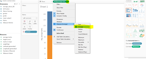
For this chart, we have to pull the gender dimension to the Marks tab and average marks measure onto rows (change the calculation from SUM to AVG) as shown below:
We can drag and drop any size or measure depending on the desired results and switch to any type of chart as required. The bottom right shows the number of steps, dimensions, or measures we need to generate every table. The above graph displays continuous value; however, we can also show discrete value:
Knowing the Grades of Students
Let us say we want to know each student's grades based on their average marks. All you need to do for that is select the average marks row, drag and drop category and name columns, select the chart of your choice, and bingo!
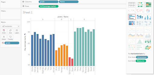
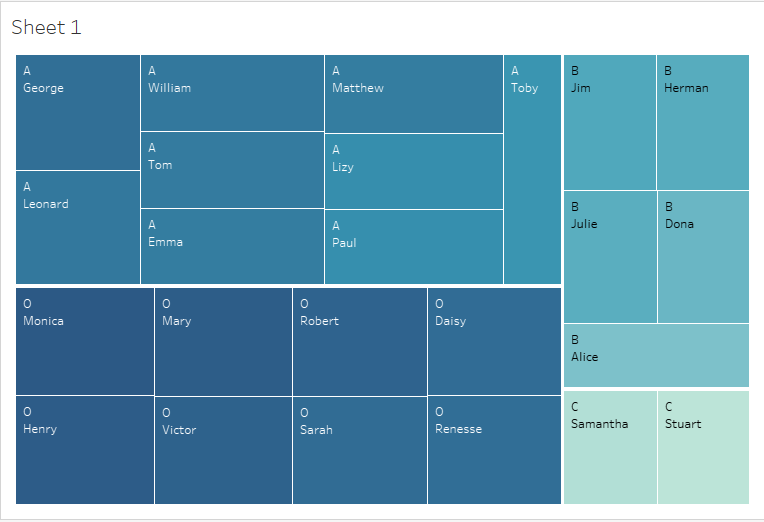
You can see that the data is neatly grouped based on the grade. The left diagram shows a histogram, while the right one represents Treemap. If you have data to practice with, you can keep adding more columns to increase the complexity. The more data you have, the more fun you can play with it.
For example, if we add a country column in our sheet, we can group students based on the country and get their median or average marks. Similarly, we can add a column for primary subjects and then analyze data on which topics are the most scoring for the students and so on.
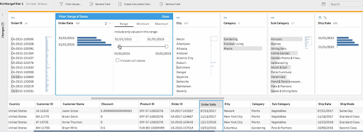
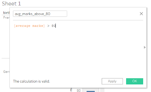
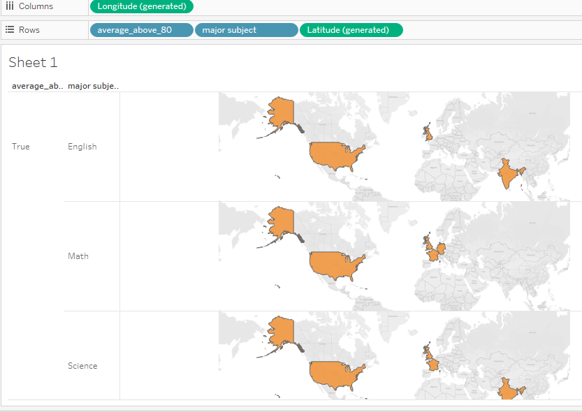
Knowing the Students Scoring 80+ Average Marks
Let us say we want to know students who have scored average marks above 80 and in which subjects. For that, we need to create a filter:
Once we drag the screen, we are presented with something like this:
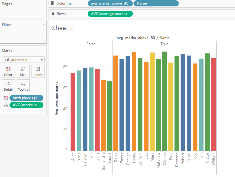
Important things to notice here:
- Data for all the students are shown; those with average marks less than 80 are grouped under false. If you go back to the data source tab, you will see this calculated field (avg_marks_above_80) added as a column with true or false values.
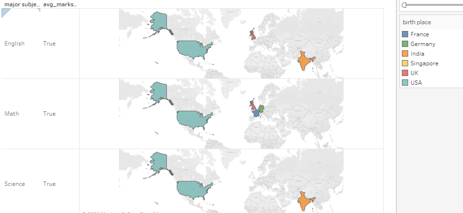
- The color coding indicates the location they are from. For example, pink is for Germany, orange is for India, and so on. Tableau puts default colors, but we can change them. Check out the birthplace dimension on the Marks' card.
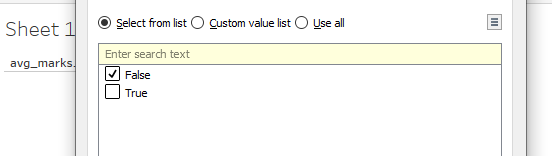
- If I want to see only the false value records, we can edit the filter and uncheck the true checkbox.
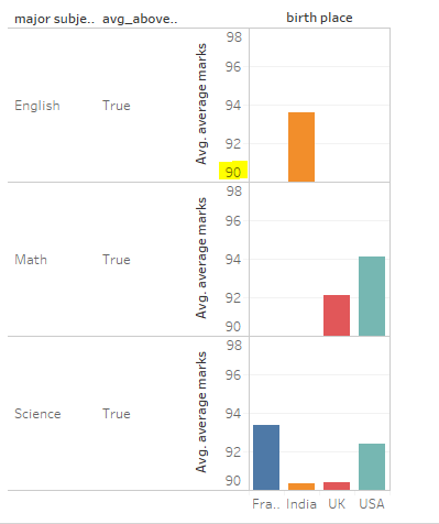
Country of Students Scoring 80+
Similarly, if we want to know what country the students who have scored above 80 in each subject belong to, we can drag and drop those columns:
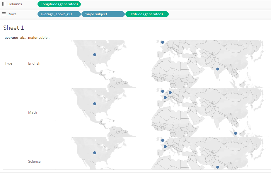
You can drag the country in the Marks card and apply colors like this:
Based on the country or region name, Tableau automatically calculates longitude and latitude and displays the same in two different formats. We can represent the same using other charts like stacked bars or side-by-side bars. Let us get this information in a side-by-side bar by doing the following:
- Drag the average marks and significant subjects to the rows.
- We have already added a calculated field named avg_marks_above_80 and are categorizing the information based on birthplace. Drag both as columns.
- Edit the avg_marks_above_80 filter to display only True values.
Now, you will get a chart like this:
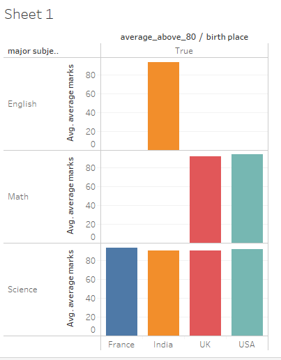
You might be wondering why all the values look almost the same. This is because the variations are small in the data. We can start the index from 80 instead of 0, and then we can appreciate the differences more. To do so, double-click on the axis (average marks), and a window will appear:
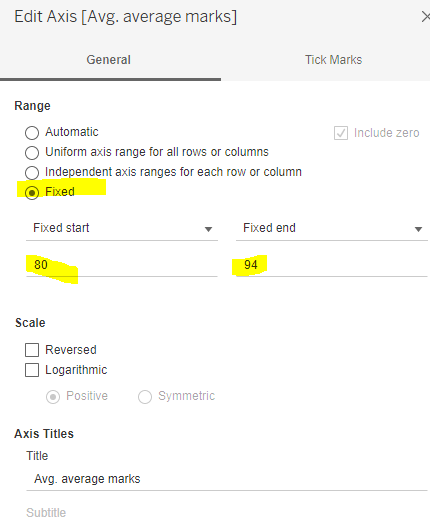
Change the range from automatic to fixed and specify the range. Move to the next tab (Tick Marks):
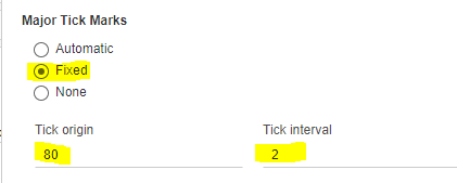
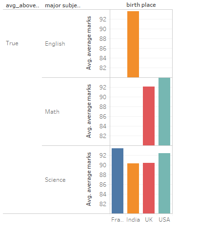
Again, change the values of Tick origin and interval as desired. Now, we see the variations more clearly as follows:
Try creating another calculated field with average_above_90 and see if you get the following:
Note that these examples have been created for learning purposes only so that we can understand more features of Tableau. You can play around as much as you want by moving the columns and rows up and down and seeing how the charts change.
A Little About Line Charts
Tableau also shows you the parameters you need to generate a line chart:
Let’s say you want to calculate the average marks obtained by the class based on the year of joining and the primary subject. Sounds a lot. Tableau will do it all for you. All you have to do is drag and drop all the rows and columns you need.
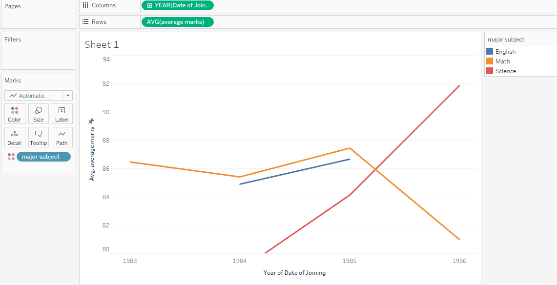
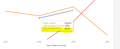
Take the blue line (English), for example:
- As per our data, no students took English as a significant in 1983 and 1986.
- In 1984, the average marks of those who had English as a significant were 84.9, as pointed out in the chart ((93.6 + 76.2)/2). If you hover your mouse on the point, you will get the details like this:
The same holds for other subjects too. All of this is just a representation of data. The real power of Tableau comes with analysis using trend lines and forecasts. The tool uses AI to show trends, discover patterns, and predict the future. To predict or forecast, we need data for a more extended period.
Insights from the Data
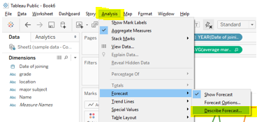
Let’s try to get some insights from this data. Click on Analysis, Trend lines, and then Show trends:
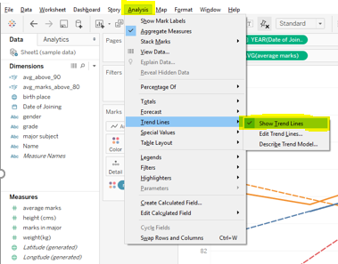
Tableau will show something like this:
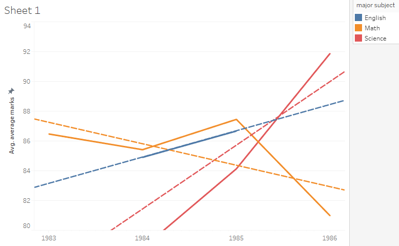
We can infer that while English and Science show a general upward trend, Math shows a downward trend. But as we said, this data is not enough to generate the forecast. Thus, we have added some more data on students with different years of joining.
Let us get the same line chart for the new dataset:
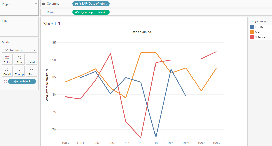
The data we have now is for 10 years instead of 3 years. Let us draw the trend line now:
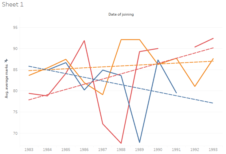
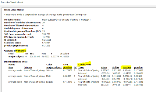
As we see, with more data, we have better trends than previous trends. We see a downward trend for English, whereas Math is almost stable (no steep trend). If you click on to describe the trend, you can get all the mathematical values that are needed for in-depth analysis:
Let us now generate a forecast for the next 3 years:
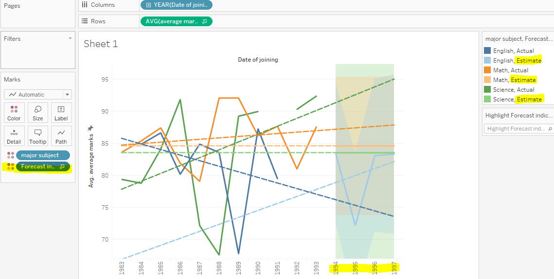
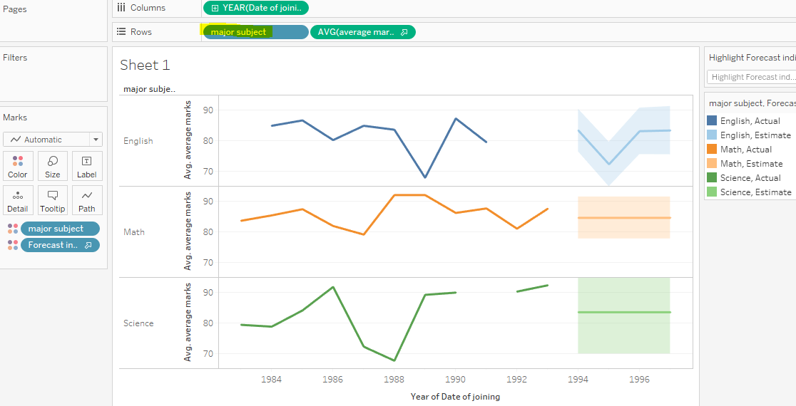
If you don’t like the crisscrossing of lines, add major subjects as a row, and you will get individual lines like this:
Just for fun, switch from line chart to area chart to see the same results:

Now, we can see the description of the forecast:
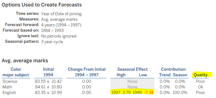
Notice that the prediction quality is still OK for Maths, but for others, it is not. This could be because the data is insufficient or not of good quality. The forecast also shows a negative trend for English. The critical point is how detailed the analysis is without us putting any significant effort. Tableau did every calculation within minutes. Thus, we could swap rows and columns, add or remove columns, and play around with data to see different results.
Top Benefits of Tableau
-
A Broad Spectrum of Visualizations
The tool's built-in features let you create unique and fantastic visualizations of unordered data. In addition, you can switch between different visualizations to bring the context of the data to light even more clearly while exploring the data in-depth.
-
User-Friendly
As mentioned earlier, people without technical or programming knowledge can easily use this tool. The tool's user-friendliness is among the primary factor for its popularity. The drag-and-drop interface makes it easy to use, even for novices and non-technical users.
-
In-Depth Insights
The tool allows you to look at the same data from different angles. It helps businesses analyze data without any specific goals or objectives.
-
Supports Distinct Data Sources
In this data-driven world, organizations leverage big data to extract meaningful insights and make informed decisions that help them grow. This big data originates from multiple sources and is structured, unstructured, and semi-structured. Tableau supports data from data warehouses, databases, spreadsheets, cloud files, non-relational data, etc. It connects data from these sources and makes them available in a single place to create attractive visualizations.
-
Easy to Add Datasets
Adding new datasets and blending them with Tableau is very easy.
Uses of Tableau
- Business intelligence
- Data visualization
- Data collaboration
- Query translation to visualization
- Manage and import large sizes of datasets
- Real-time data analysis
- Data blending
Wrapping Up!
With the increasing usage of the internet and electronic devices, the amount of data is generated in quintillions every day. And this data is beneficial for businesses to understand their customers and improve services or products.
Business intelligence tools like Tableau come in handy to make the most out of that data. It is one of the most preferred data visualization tools in the business intelligence industry. It allows businesses to analyze heaps of data and represent insights using different visualizations, making it readable and easy to understand.
We hope the above example has helped you understand how Tableau works. You can try it on your system and understand practically how it works.
People are also reading:


Leave a Comment on this Post