
What is Grid-View?
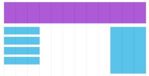
While designing a page, we can divide the page into multiple columns, like a grid. This grid approach helps us to set content on the web page with ease. Using the grid-view, we can define different columns for different sections of the page. For instance, the header can take all the grid columns, and the main content can fit in the center half of the grid columns, and so on. [caption id="attachment_7223" align="aligncenter" width="696"]
Grid View[/caption] In responsive web-pages, the web page is divided into 12 columns. Even if you shrink or expand the page, the column count will remain 12.
Building a responsive Grid-View
Let’s create a responsive grid view The first step toward writing CSS code for a responsive web-page set the box-sizing property to border-box for all the elements. To set a property for all the elements, we use the * asterisk selector. By selecting this property, the padding and border area of the element will be included within the specified height and width of the element, this prevents from the problem of content overlapping.
CSS
*{

box-sizing:border-box;

}
Calculate the width of the page or section
By default, every container comes with a width of 100%, the
<body>
element itself is a container that represents the overall web-page. And most of the responsive web-pages divided into 12 columns, so first, we need to find the percentage of each column. 100%/12 = 8.33%, This means each column has 8.33 percentage of width area associated with it. Using this technique, we can define 12 classes col-1 to col-12, which occupy different column space.
Example
.col-1 {width: 8.33%;}

.col-2 {width: 16.66%;}

.col-3 {width: 25%;}

.col-4 {width: 33.33%;}

.col-5 {width: 41.66%;}

.col-6 {width: 50%;}

.col-7 {width: 58.33%;}

.col-8 {width: 66.66%;}

.col-9 {width: 75%;}

.col-10 {width: 83.33%;}

.col-11 {width: 91.66%;}

.col-12 {width: 100%;}
By setting this, we can easily define the number of columns an element should occupy. for instance, we define a
<div>
element, and we want it to occupy seven columns from left, then we can write this HTML code
<div class= "col-7" style= "float:left">
Example
Let’s see with an example of how the grid-view helps us setting the layout of the page.
<!DOCTYPE html>
<html>
<head>
    <meta name="viewport" content="width=device-width, initial-scale=1.0">
    <style type="text/css">

        *{box-sizing: border-box;}

        .col-1 {width: 8.33%;}
        .col-2 {width: 16.66%;}
        .col-3 {width: 25%;}
        .col-4 {width: 33.33%;}
        .col-5 {width: 41.66%;}
        .col-6 {width: 50%;}
        .col-7 {width: 58.33%;}
        .col-8 {width: 66.66%;}
        .col-9 {width: 75%;}
        .col-10 {width: 83.33%;}
        .col-11 {width: 91.66%;}
        .col-12 {width: 100%;}

        header{ background-color: lightgreen;
                height: 100px;
                text-align: center;
                padding: 20px;
              }

        #left_menu{
            background-color: lightblue;
            height: 400px;
            text-align: center;
            padding: 20px;
            float: left;
        }

        #content{
            background-color: red;
            color:white;
            height: 400px;
            text-align: center;
            padding: 20px;
            float: left;
        }

        #right_menu{
            background-color: lightblue;
            height: 400px;
            text-align: center;
            padding: 20px;
            float: left;
        }
    </style>

</head>
<body>
    <header class="col-12">
        <h1>This header will occupy all the 12 columns</h1>
    </header>

    <section id="left_menu" class="col-2">This Section will occupy only two columns</section>

    <article id="content" class="col-8">This article will occupy 8 Columns</article>

    <section id="right_menu" class="col-2">This Section will occupy only two columns</section>
</body>
</html>
Summary
- In the grid-view approach, we divide the webpage into 12 columns.
- Based on these 12 columns, we decide the content columns for the web-page.
- Many web-sites generally divide its web-page into 12 columns.
-
It’s always suggested to set the
box-sizingproperty toborder-box.