

What is R?
R is a programming language much suited for statistical computing and graphics. R is free and used by data scientists all over the world for data analysis and mining. R is a popular GNU package, written mostly in C, Fortran, and R itself. Since R is an interpreted language, you can use R using CLI (command-line interface). However, it is recommended to use RStudio, which is an IDE that makes coding and visualization easy. R is highly extensible and has strong OOP capabilities compared to other languages.
A bit of history
R is an implementation of the programming language ‘S’, as a part of the GNU free software project. Read more about R’s history from Wikipedia .
Why R for data science?
A lot of people have this question – the reason being, Python is another data-friendly language that provides rich libraries to perform many calculations. The truth is both R and Python are excellent choices for data science, and R is more suitable where there are heavy statistical calculations involved. R is also the right choice when it comes to data visualization, because of its rich set of graphical libraries, including those for image processing and machine learning. The data structures like vectors, matrices, data frames, amongst others, make it a practical choice for data manipulation.
Features of R
R has a lot of features, including features of a general-purpose programming language, as well as features specific to data analysis and visualization.
- Effective data handling and storage
- Very easy to learn, simple syntax, efficient, and has all the features like loops, conditions, I/O, functions, vectors, etc.
- An extensive set of integrated tools for data analysis
- Rich libraries for graphics
- Provides cross-platform support, is open-source and extremely compatible with other data processing technologies
- Very supportive and large community
How to install R?
To install R, visit the
CRAN-R website
to download the distribution based on the operating system. Choose the option “install R for the first time.” Click on “Download R 4.0.1 for Windows” and run the same to download the distribution. Follow the instructions for installation. For ease of coding, as a next step, let us install RStudio too. Download and install the RStudio desktop distribution (free) from the
RStudio website
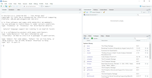
. Once you install and open RStudio, you should get a screen like this –
R data types
The next step is to explore various data types in R. The basic data types in “R” are – vectors, lists, matrices, arrays, factors and data frames. Vectors –Vectors can be character, double, complex, integer, logic and raw. We can add, subtract, multiply, divide vectors. For example,
v1 <- c(1,2,3,4,5,6)
v2 <- c(1,2,3,4,5,6)
print(v1+v2)
will give output as –
> print(v1+v2)
[1] 2 4 6 8 10 12
Note that for the program to run on RStudio, you have to select the lines you want to be executed and then click on ‘Run’. List – A list can contain different types of elements like integers, characters, vectors, float etc….
mylist <- list(24.5, 34, c(2,5,3))
print(mylist[2])
will give the output as 34. Matrices – matrix is a 2D representation of data. Matrices are created by giving vectors as input to the matrix function. Let us create a 3x3 matrix using the following code –
M1 = matrix( c('a','b','c','d','e','f','g','h','i'), nrow = 3, ncol = 3, byrow = TRUE)
print(M1)
Here, nrow and ncol are the number of rows and columns respectively. The matrix is divided byrow.
> print(M1)
[,1] [,2] [,3]
[1,] "a" "b" "c"
[2,] "d" "e" "f"
[3,] "g" "h" "I"
If you change byrow to FALSE or do not specify the value, you will get the output as –
> print(M1)
[,1] [,2] [,3]
[1,] "a" "d" "g"
[2,] "b" "e" "h"
[3,] "c" "f" "i"
Arrays – As we mentioned above, matrices take care of two-dimensional data. More than often, we need more dimensions, and such datasets are taken care of by using arrays that can store n-dimensional data. Let us say, we want to convert our vector v1 to a 2d array –
dim(v1) <- c(3,2)
The output will be –
> print(v1)
[,1] [,2]
[1,] 1 4
[2,] 2 5
[3,] 3 6
To create a 3D array, we need more elements in the vector, let's have another vector v3 <- c(1,2,3,4,5,6, 7, 8)
dim(v3) <- c(2,2,2)
This will give you output as –
, , 1
[,1] [,2]
[1,] 1 3
[2,] 2 4
, , 2
[,1] [,2]
[1,] 5 7
[2,] 6 8
The next important data type is factor. Factor allows for storing the values along with the number of distinct appearances as a vector. It can be created using the factor() function. A simple example – #illustration for factor
no_of_ranks <- c(1,2,3,1,2,3,1,2,3,4,3)
factor_ranks <- factor(no_of_ranks)
print(factor_ranks)
print(nlevels(factor_ranks))
will give the output as:
> print(factor_ranks)
[1] 1 2 3 1 2 3 1 2 3 4 3
Levels: 1 2 3 4
> print(nlevels(factor_ranks))
[1] 4
As you see the vector contains numbers from 1 to 4 (called as levels). Therefore, there are 4 unique (distinct) values. The number of levels or nlevels tells just that. Factors are a great way to categorize data. DataFrames – Data Frames represent data in a tabular format. Each column can represent a different type. Simply put, data frames consist of various vectors (columns) that have the same number of values (size). A simple example –
> hod_name <- c("Brunda", "Dany", "Phoebe")
> deptt_name <- c("ece", "cse", "eee")
> salary <- c("25000", "35000", "40000")
>
> hod_details <- data.frame(hod_name, deptt_name, salary)
> print(hod_details)
hod_name deptt_name salary
1 Brunda ece 25000
2 Dany cse 35000
3 Phoebe eee 40000
As you might have noticed, we use data.frame(v1, v2,v3….) to create the data frame. If we want to add a new row to this data frame, we can use the rbind function. To add columns, we use <dataframename>$<newvectorname>. Now, that we have learned about the major data types, let us move on to doing some statistical tasks using R.
Control structure, loops and more
To make decisions, we use if/else statements, if there are a limited number of outcomes. If there are multiple outcomes, switch case is a better choice. If/else in R works in a similar manner as any other programming language –
> A <- "Name"
> B <- "Place"
>
> if(A == B){
+ print("Equal")
+ }else{print("Not equal")}
[1] "Not equal"
Just like other languages, R supports while and for loops. R also supports another loop type, i.e. repeat. Repeat is similar to the do-while in languages like Java. A simple example of a for a loop –
> MyStrings <- c("Name", "Place", "Animal", "Thing")
>
> for(value in MyStrings){
+ print(value)
+ }
[1] "Name"
[1] "Place"
[1] "Animal"
[1] "Thing"
>
Let us say, you have a vector myVector <- c(1:20) and you want to add 5 to each of the values. Well, with R, we need not create a loop for that! We can simply use the function + 5 and change all the values at once!What if you had to modify each value inside a vector? Which loop would you use?
myVector <- c(1:20)
> print(myVector)
[1] 1 2 3 4 5 6 7 8 9 10 11 12 13 14 15 16 17 18 19 20
> mynewvector <- myVector+5
> print(mynewvector)
[1] 6 7 8 9 10 11 12 13 14 15 16 17 18 19 20 21 22 23 24 25
>
Functions provide a cleaner way to access common functionalities and lengthy code. Defining R functions
> addValues <- function(val1, val2)
+ {
+ result = val1 + val2
+ }
>
> print(addValues(10,30))
[1] 40
Finding mean and median
R provides inbuilt functions to calculate mean and median of data.
> #find mean & median
> mydata<- c(1,2,13,4,15,6,17)
> print(mean(mydata))
[1] 8.285714
> print(median(mydata))
[1] 6
In a real-world scenario, there might be many missing values in the data. Suppose,
mydata<- c(1,2,13,4,15,6, NA,17)
Mean and median both have a property na.rm which can be specified while calling the respective functions. Giving a value of true, i.e. na.rm = true will remove the missing values from the vector.
Simple plots
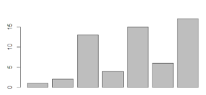
R provides loads of options for plotting the data. The simplest of all the charts is a bar chart. Let us create a chart for our above vector mydata.
mydata<- c(1,2,13,4,15,6,17)
barplot(mydata)
 So, those were some fundamental topics of R for data science. R is not about just these. In the next section, let us discuss some significant R packages that can perform productive data science tasks.
R packages
R has some great packages for performing data science tasks. Here are some of the most popular packages of R for data science –
- Ggplot2 – This is one of the most powerful, flexible packages for data visualization. It follows the ‘grammar of graphics’ syntax that gives well-structured visualizations using the relationships between data attributes. R provides exhaustive documentation on how to install and use this package.
- Dplyr – Dplyr package is used for data wrangling and analysis, especially when working with data frames. For data manipulation, dplyr provides five main functions that are more than sufficient – select particular columns of data (data frame), filter data, order (arrange) the data, add new columns to the data frame, summarize the information. Read how to use dplyr .
- Mlr – This package is dedicated to machine learning tasks. It contains most algorithms like classification, regression, clustering, multi-classification, and survival analysis. It also has methods for feature selection, which is otherwise a tedious task. Check out the documentation for details on the methods of mlr.
- Esquisse – You can consider this package to be an improvement over ggplot2. This package brings the most essential and useful features of Tableau into R so that you can just drag and drop attributes and get insightful visualizations in seconds. You can draw different types of charts, graphs, plots, and then export those to PNG or PowerPoint. Here is the detailed documentation where you can refer to all the methods and arguments supported by esquisse.
- Tidyxl – Tidyxl is used for data import and wrangling. If your excel is messy and has a lot of inconsistencies, tidyxl, as the name says, will clean it up for you, by importing each cell in its row. Data is put in its correct position, color, value, and other attributes. The final output will be data that you can use for exploratory analysis and further filtering. Learn more about the package from this CRAN page .
- Janitor – This package is extensively used for data wrangling and data analysis. The package offers various methods to clean, filter, sort data, remove duplicates and empty columns, etc. This package makes working with data frames easy, such as adding a complete row, generating tables, finding duplicate rows, etc. The R documentation page gives more information about this package.
- Shiny – Shiny is a very commonly used package for data visualization. You can share the visualizations with others as well. The package enables you to build interactive web applications, dashboards, embedded documents etc. Shiny functions are similar to those of HTML, minus the <> tags, for example, span, img, strong, etc. Shiny apps can be extended with JavaScript actions, HTML widgets, and CSS themes. Shiny is easy to learn – follow this tutorial .
- KnitR – KnitR is a general-purpose R package for dynamic report generation. With knitR, R code can be integrated into HTML, LaTeX, Markdown, etc. It has light-weight APIs and is a much-suited package even for those having very less or no programming language experience. Learn more about knitR through the R documentation page.
- Lubridate – Lubridate package handles date-time very well. It has methods for parsing, setting and getting date information, time zones, time intervals, vectorization, and date manipulations using methods like finding the duration, leap year, etc. Read more about Lubridate.
- Leaflet – This is an open-source JavaScript library for interactive maps. It supports almost all desktop and mobile platforms that support HTML5 and CSS3. It has a simple, highly performant, and light-weighted API. The leaflet can be extended with additional plugins. Check out the leaflet website for tutorials, docs, plugins, and more.
Exploratory data analysis using R
Previously, we have done a simple analysis using Python with a small dataset. I will be using the same data set here too. Below is the snapshot of the data. You can also check out the article
Python for data science
for the data file.
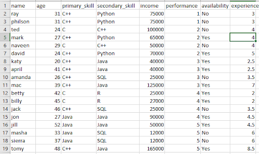
We will load the same data and learn about some basic plotting and data analysis. Let us first read the data from the CSV file.
dataset <- read.csv("<complete path>\candidate_details.csv")
# Let us see if our data has loaded properly
dim(dataset)
dim will show the number of rows and columns in the dataset. In our case, it is –
> dim(dataset)
[1] 18 8
Lets gather some more details about the data.
> #get to know the features and their types
> str(dataset)
'data.frame': 18 obs. of 8 variables:
$ name : chr "ray" "philson" "ted" "mark" ...
$ age : int 31 31 24 27 29 24 20 41 26 39 ...
$ primary_skill : chr "C++" "C++" "C" "C++" ...
$ secondary_skill: chr "Python" "Python" "C++" "Python" ...
$ income : int 75000 75000 100000 65000 50000 70000 40000 40000 25000 125000 ...
$ performance : int 1 1 2 2 2 2 3 3 3 3 ...
$ availability : chr "No" "No" "No" "Yes" ...
$ experience : num 3 3 4 4 4 5 2.5 2.5 3.5 7 ...
>
Note how str(dataset) gives overall information about the columns and their data types in R. Although our sample dataset doesn’t have any missing values or duplicates, in reality, it is a very likely scenario. We can use a simple function colSums(is.na(dataset)), and R will display the details for you if any. As we have seen above, the most straightforward and most widely used package for visualization is ggplot2. We will use the same for some fundamental analysis. Let us start with a simple point plot of income vs experience, that will tell us how the income is distributed amongst the various groups.
> ggplot(dataset, aes(x= experience, y = income)) + geom_point(size = 2.5, color="navy") + xlab("experience") + ylab("income") + ggtitle("salary vs experience")
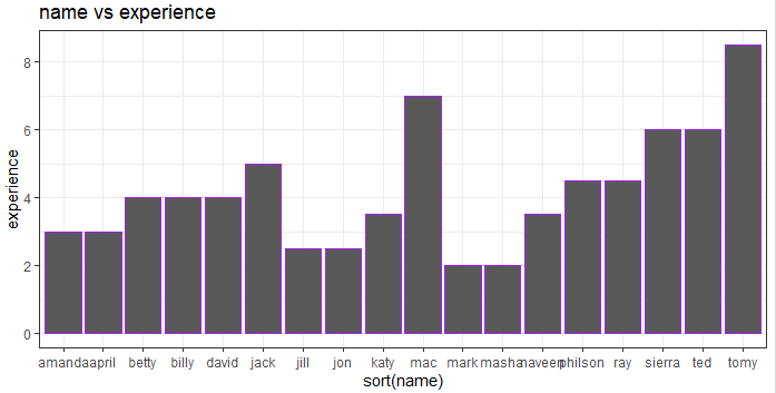
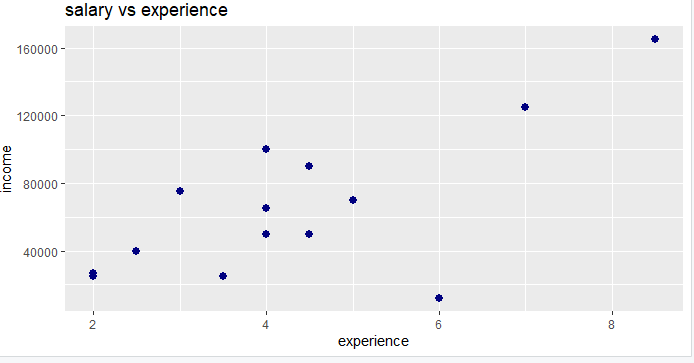 We note that there is a strange low point where income is too less for a 6year experience candidate. Let us try a bar chart showing names and experiences, sorted by names.
> ggplot(dataset, aes(sort(name), experience)) + geom_bar(stat = "identity", color = "purple") + ggtitle("name vs experience") + theme_bw()
 Let’s plot another plot that gives us performance vs primary_skills –
> ggplot(dataset, aes(primary_skill, performance)) + geom_bar(stat = "identity", color = "blue") + ggtitle("skill vs performance") + theme_bw()
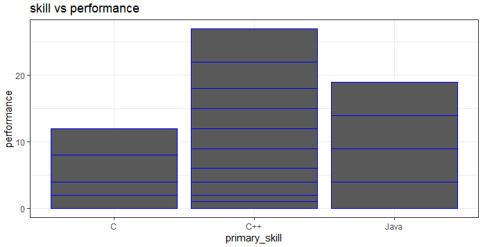
Note that we get a cumulative bar separated by blue lines. For example, the performance values for C are 2,2,4,4 as depicted in the bar graph. If we wanted to know what is the experience level of candidates with the required skills, we could show the same using boxplot –
> ggplot(dataset, aes(primary_skill, experience)) +geom_boxplot()
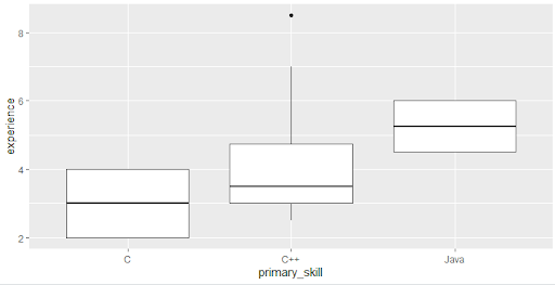
Note that all the values fall within the box and whiskers, except one that is notified by the dot. The experience 8.5 doesn’t fall in any of the plots. What is such a value called? Yes, you got it, that’s an outlier! What if we wanted to know only about those who are available and have a performance rating above four so that they can participate in a weekend gaming event?
> dataset_gmevent <- dataset[which(dataset$availability == 'Yes' & dataset$performance > 3),]
>
> str(dataset_gmevent)
'data.frame': 5 obs. of 8 variables:
$ name : chr "betty" "billy" "jon" "jill" ...
$ age : int 42 45 27 52 48
$ primary_skill : chr "C" "C" "Java" "Java" ...
$ secondary_skill: chr "R" "R" "Java" "Java" ...
$ income : int 25000 27000 90000 50000 165000
$ performance : int 4 4 4 5 5
$ availability : chr "Yes" "Yes" "Yes" "Yes" ...
$ experience : num 2 2 4.5 4.5 8.5
Now, dataset_gmevent is our new data frame. Let us plot a simple histogram, just to see the range of experience.
> experience <- dataset_gmevent$experience
>
> hist(experience)
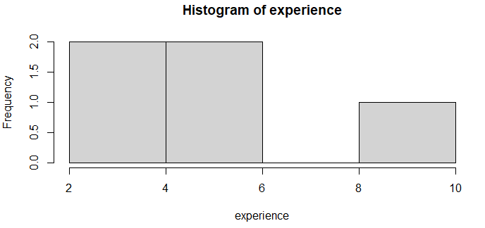
This is a straightforward plot that shows the range of experience, for example, there are no persons with work experience between 6-8 years. If you notice, in our new dataset, all the values of availability are yes – because we sorted only those! This means that the availability column is redundant and can be removed – isn’t it? For this, we will use the dplyr package – the select method. Note that while installing dplyr, you will also have to install the purr package, else you will get an error while using the select() method.
install.packages("dplyr")
install.packages("purrr")
library(dplyr)
dataset_gmevent <- select(dataset_gmevent, -c(availability))
str(dataset_gmevent)
This will give the following result –
'data.frame': 5 obs. of 7 variables:
$ name : chr "betty" "billy" "jon" "jill" ...
$ age : int 42 45 27 52 48
$ primary_skill : chr "C" "C" "Java" "Java" ...
$ secondary_skill: chr "R" "R" "Java" "Java" ...
$ income : int 25000 27000 90000 50000 165000
$ performance : int 4 4 4 5 5
$ experience : num 2 2 4.5 4.5 8.5
Note that the availability column is gone. Now, to select the candidates for the event, we need to know who all are highly performant and have the right skills, i.e. C++. Let us use a decision tree classifier for this and see if we get the desired results! To do this, we will need to install and load various libraries.
install.packages('rpart')
install.packages('caret')
install.packages('rpart.plot')
install.packages('rattle')
#Loading libraries
library(rpart)
library(caret)
library(rpart.plot)
library(rattle)
After installing the libraries, we need to find out the variable that will be best suited to split the data. For example, primary_skill would be one variable to make the decision.
tree <- rpart(primary_skill~.,
+ data=dataset,
+ method = "class")
>
> rpart.plot(tree, extra=109, box.palette = "white")
Since our data is less and much sorted, we will have only 1 level of iteration to get the output.
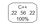 The above means there are more chances of a person with primary_skill as C++ to be chosen for the event. If you see the above, you would have understood that the models don’t require much data preparation other than removing missing values and duplicates. That is the power of R. In particular, for the decision tree, R uses Gini impurity measure to split the nodes. You can try other algorithms like linear regression, SVM, random forest, and so on. Note that we did not split this data into training and testing sets, as the information is minimal. However, if you are working with a large data set, you can use the data preparation package for the same.
The road ahead
In this article, we have understood the basics of R for data science so that you can make an informed decision about choosing R or Python for your data science career. Check out our Python for data science article for a similar understanding of Python. R has some great options like vectors that are easy to manipulate, plot, and visualize. It has packages that perform just any task smoothly and efficiently. This makes R an excellent choice for data science tasks, such as import, munging, visualization, and modeling. If you want to learn more about R, start with the book, “ R for data science ”. People are also reading:
- Why Learn Data Science with R Programming?
- R Interview Questions and Answers
- R vs Python
- Data Science Lifecycle
- Data Science vs Data Mining
- Big Data Frameworks for Data Science
- Data Science Process
- Career Opportunities in Data Science
- Top Data Science Programming Languages
- Data Science for Beginners


Leave a Comment on this Post