

Data visualization is an essential skill for every data scientist. The Python programming language has many third-party data visualization libraries. In this tutorial, you will learn Python histogram plotting using Matplotlib, Pandas, and Seaborn. A histogram is a graphical representation of distributed data. It is useful to represent the numerical data destitution with its frequency. It is similar to the bar plot graph, where the X-axis signifies the bin ranges or data distribution and the Y-axis represents the frequency of the data.
Python Histogram Plotting
1) Plotting a Histogram Using the Matplotlib Library
Matplotlib is the standard data visualization library of Python for data science. It is one of the most popular and widely used Python data visualization libraries , and it is compatible with other Python data science libraries like NumPy, scikit-learn, Pandas, and PyTorch. Using Matplotlib, you can create interactive and beautiful graphs. Matplotlib supports a wide range of graphs, including bar plot graphs, pie graphs, scatter graphs, and histograms.
Create a Histogram with Matplotlib
The matplotlib library supports an inbuilt method,
hist()
, which accepts an array of data values and plots a histogram.
Python Matplotlib hist() Syntax and Parameters
from matplotlib import pyplot as plt

plt.hist(array, bins, range, density, weights, cumulative, bottom, histtype, align, orientation, rwidth, log, color, label, stacked, data, **kwargs)
hist() Method Parameters
| Parameters | Description |
| array(x) | The array of data. |
| bins (optional parameter) | Integers or sequences or strings. Defines the number of equal-width bins. |
| range(optional parameter) | Tuple values. Defines the lower and upper range of bins. |
| density(optional parameter) (default: False) | A Boolean value defines the probability density. |
| weights (optional parameter) (default:None) | An array value with the same length or shape of array(x). It associates weight with individual array(x) values. |
| cumulative (optional parameter) (default:false) | A Boolean value if true each bin will give the count. |
| bottom (optional parameter) (default:None) | An array-like structure. Define the location of the bottom of every bin. |
| histype (optional parameter) (default:”bar”) | It defines the type of histogram drawn. Other values “barstacked”, “step”, and “stepfilled.” |
| align (optional parameter) (default:mid) | It defines the horizontal alignment of histogram bars. It could be left, right, or mid. |
| orientation (optional parameter) (default: vertical) | It defines the orientation of the hist graph. Its value can either be vertical or horizontal. |
| rwidth (optional parameter) (default: None) | Floating-point values define the relative width of bin bars. |
| log (optional parameter) (default: False) | The true value will set the histogram axis to the log scale. |
| color (optional parameter) (Default: None) | It defines the color of bars. |
| label (optional parameter) (default: None) | String value to match multiple data sets. |
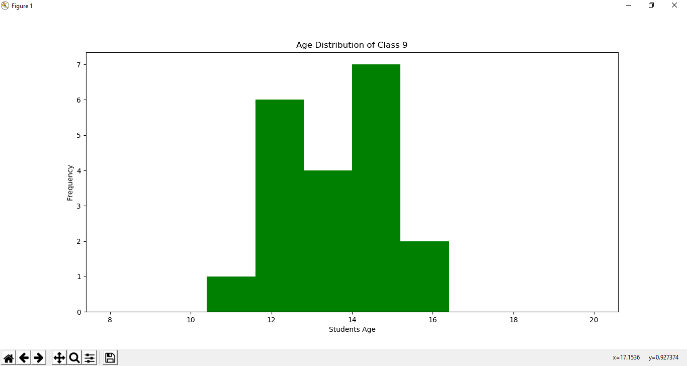
Example
from matplotlib import pyplot as plt

import numpy as np

students_age = [12, 12, 13, 14, 13, 12, 15 ,15 ,11, 12, 13, 12, 14, 15, 16, 15, 12,13, 14, 16]
numpy_array = np.array(students_age)

# Create histogram
fig, ax = plt.subplots(figsize =(10, 7))
ax.hist(numpy_array, range = (8, 20), color="green" )

plt.title("Age Distribution of Class 9")
plt.xlabel("Students Age")
plt.ylabel("Frequency")

# Show plot
plt.show()
Output
2) Plotting a Histogram Using the Python Pandas Library
Python
Pandas
library is a powerful data science library. It is built on many
popular Python libraries
like numpy and matplotlib. In Pandas, the 1-D and n-D arrays are defined as Series and DataFrame. And the Panda series and DataFrames come with the histogram module that is inherited from the
matplotlib.pyplot.hist()
method.
Create a Histogram with Pandas
Drawing a histogram using Pandas is very easy and straightforward. You just need to define a Pandas series and DataFrames, and the
.hist()
method will plot a histogram for you based on the series data.
Python Pandas Series and DataFrame
hist()
Syntax and Parameters
DataFrame.hist(column,by, grid, xlabelsize, xrot, ylabelsize, yrot, ax, sharex, sharey, figsize, layout, bins,backend, legend, **kwargs)
Pandas Series and DataFrame hist() Method Parameters
| Parameter | Description |
| column (Optional Parameter) (default: None) | The string value defines the limit data to a subset. |
| by (Optional Parameter) (default: None) | An object defines a histogram for separate groups. |
| grid (Optional Parameter) (default: True) | Defines the grids for the figure. |
| xlabelsize (Optional Parameter) (default: None) | The integer value defines the x-axis label size. |
| xrot (Optional Parameter) (default: None) | A float value rotates the x-axis label by the specified degree. |
| ylabelsize (Optional Parameter) (default: None) | The int value defines the y-axis label size. |
| yrot (Optional Parameter) (default: None) | Rotates the y-axis label by a specified degree. |
| ax (Optional Parameter) (default: None) | It defines the axes on which the histogram will be plotted. |
| sharex (Optional Parameter) (default: True) | Boolean value if subplots=True share x-axis and set some x-axis label to invisible. |
| sharey (Optional Parameter) (default: True) | Boolean value if subplots=True, share y-axis and set some y-axis label to invisible. |
| figsize (Optional Parameter) (default: None) | Tuple value and define the size of the figure. |
| layout (Optional Parameter) (default: None) | Tuple value and defines (rows, columns). |
| bins (Optional Parameter) (default: 10) | An integer or sequence value and defines the number of bins. |
| backend (Optional Parameter) (default: None) | It represents the backend specified options. |
| legend (Optional Parameter) (default: False) | Boolean values define whether to show the legend or not. |
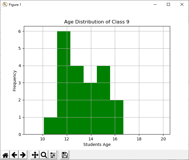
Plot a Histogram Using Pandas
import pandas as pd
import matplotlib.pyplot as plt

students_age = [12, 12, 13, 14, 13, 12, 15 ,15 ,11, 12, 13, 12, 14, 15, 16, 15, 12,13, 14, 16]
panda_series = pd.Series(students_age)

# Create histogram
hist  =  panda_series. hist( grid=True,range=(9,20), color="green")

plt.title("Age Distribution of Class 9")
plt.xlabel("Students Age")
plt.ylabel("Frequency")

#plot graph
plt.show()
Output
3) Plotting a Histogram Using the Python Seaborn Library
The Seaborn library is a production-ready Python data visualization library. It is built on the Python standard matplotlib library and supports a wide range of graphs. Data scientists prefer using Seaborn more than matplotlib because it can do more things with less code and less complexity.
Create a Histogram With Seaborn
Seaborn provides the
hisplot()
method, which can accept data in a sequence format, including DataFrame, numpy array, and Python list to plot a histogram.
Python Seaborn
histplot()
Method Syntax
seaborn.histplot(data)
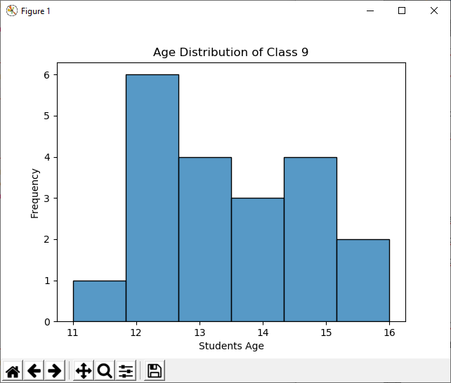
Plot a Histogram Using Seaborn
import seaborn
import pandas as pd
import matplotlib.pyplot as plt

students_age = [12, 12, 13, 14, 13, 12, 15 ,15 ,11, 12, 13, 12, 14, 15, 16, 15, 12,13, 14, 16]
panda_series = pd.Series(students_age)

# Create histogram
seaborn.histplot( panda_series)

plt.title("Age Distribution of Class 9")
plt.xlabel("Students Age")
plt.ylabel("Frequency")

#plot graph
plt.show()
Output
Conclusion
From all the above examples of Python histogram plotting, you can see that the histogram plotted using Seaborn is clearer and that with less code. Mostly all the Python data visualization libraries are built on top of the Python Matplotlib library. Thus, you need to use the
plt.show()
method to display the drawn histogram. In
Python IDEs
, you need to import matplotlib to your program if you want to show the created graph. If you use Jupyter Notebook, you can use the inline magic statement to display the graph.
People are also reading:


Leave a Comment on this Post